

Two tone walls might be the easiest way to make your space feel intentional. You’re basically painting one wall with two different colors, which sounds simple until you realize how much visual punch it actually delivers.
This technique works because it tricks your eye. Instead of scanning across flat, uniform color, your brain gets these interesting breaks and transitions to process. Plus it’s way more affordable than buying new furniture or ripping out perfectly good flooring.
The benefits stack up pretty quickly. You get visual interest without wallpaper’s commitment issues. The color blocking can separate zones in open floor plans better than furniture arrangement sometimes do. And if you’ve got architectural details like crown molding or wainscoting, contrasting colors make them pop instead of disappearing into the background.
Most people spend maybe $50-80 on paint for a feature wall versus thousands on major renovations. The ROI is kind of ridiculous when you think about it.
What Are the Best Color Combinations for Two Tone Walls?
Color pairing isn’t as mysterious as design blogs make it seem. You want colors that share undertones, not necessarily colors that “match” in some perfect way.
Warm grays work with muted oranges or soft yellows. Cool grays pair well with blues and sage greens. Benjamin Moore’s Classic Gray (affiliate link) looks completely different next to their Hale Navy versus their October Mist. Same gray, totally different vibe.
Light and dark contrasts create drama. Think Sherwin Williams Naval with their Creamy white. Analogous colors – ones that sit next to each other on the color wheel – feel more subtle but still interesting. Like a dusty rose with a deeper mauve, or sage green with a grayish blue-green.
Test your samples on the actual wall, not just those tiny paint chips from Home Depot. Colors shift dramatically depending on your lighting. That “perfect” blue might look purple under your LED bulbs or gray on a cloudy day. Get the sample pots, probably $4 each, and paint decent-sized squares. Live with them for a few days.
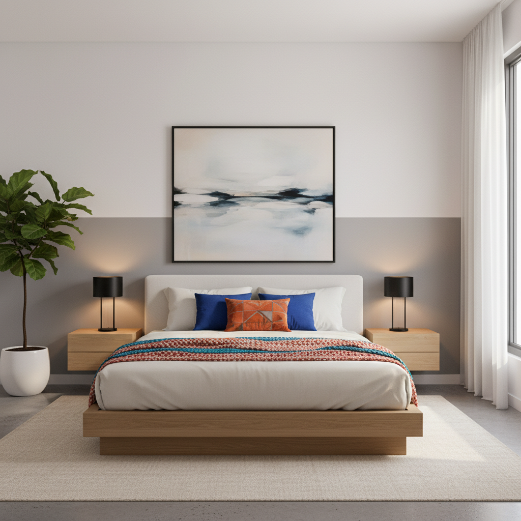
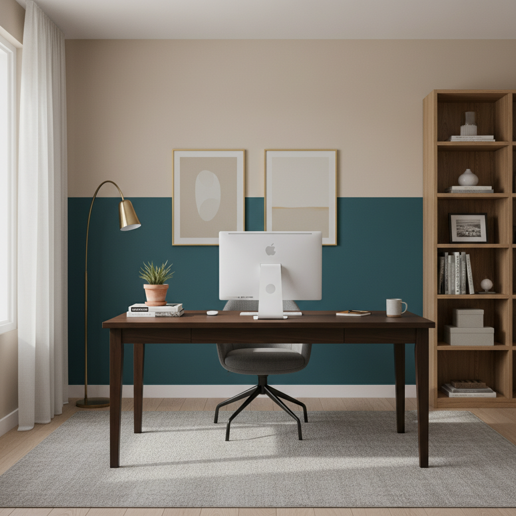
For bedrooms, softer combinations work better when creating a calming bedroom color scheme. Maybe a pale lavender with cream, or that trendy sage green with off-white. Living rooms can handle more contrast. Navy and white feels classic but not boring. Emerald green with a warm cream looks expensive, especially with brass hardware nearby.
If you’ve got a lot of wood furniture, warm neutrals make sense for balanced interior design. Behr’s Accessible Beige with their Perfect Taupe, something like that. For modern spaces, try monochromatic schemes – different shades of the same color family. Three shades of blue-gray can look surprisingly sophisticated.
The monochromatic approach is pretty forgiving actually. You’re unlikely to create something that feels jarring because the colors are naturally harmonious. Just make sure there’s enough contrast that the division reads clearly from across the room.
Don’t overthink it too much. Your gut reaction to color combinations is usually pretty reliable, and you can always repaint if something feels off after living with it for a while.
Should I Divide My Two Tone Wall Horizontally or Vertically?
Horizontal splits are more common because they’re generally easier to execute and work in most rooms. The traditional approach puts darker color on the bottom, lighter on top. This visually raises your ceiling height, which most rooms benefit from.
But you can flip it. Darker color up top brings the ceiling down visually, making large rooms feel cozier. This works well in rooms with 10+ foot ceilings that feel cavernous.
For horizontal divisions, the sweet spot is usually around 32-36 inches from the floor. That’s roughly chair rail height, which exists for a reason – it feels proportionally right to most people. You can go higher, maybe 48 inches, for more drama. Lower feels more subtle.
Vertical divisions work better than you’d expect, especially in narrow rooms. Paint one accent wall in your hallway with a vertical stripe of deeper color. Or do adjacent walls in different colors to add visual width to a cramped bedroom.
What Are Some Creative Two Tone Wall Painting Techniques?
Beyond straight lines, you can get pretty creative with two tone applications. Geometric patterns are having a moment – triangles, hexagons, abstract shapes. Stencils from places like Cutting Edge Stencils run about $20-40 and give you pretty precise results.
Ombre effects, where one color gradually bleeds into another, look sophisticated but require some patience. You’re basically blending wet paint, working quickly before it starts to dry. The technique takes practice, maybe try it in a closet first.
Color blocking with irregular shapes feels more artistic than geometric patterns. Think organic curves or asymmetrical blocks. You can sketch these freehand with pencil first, then paint within your lines.
Tape techniques create different effects depending on what you use for your DIY wall painting project. Regular painter’s tape gives crisp lines. Frog Tape is worth the extra few dollars for super sharp edges. But you can also use torn tape or textured tape for softer, more organic transitions.
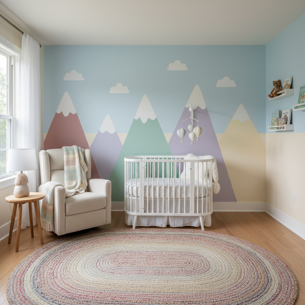
Mountain silhouettes are popular in nurseries and kids’ rooms. You sketch the mountain line, tape below it, and paint the “sky” portion a different color. Remove the tape and you get this nice landscape effect.
Tone-on-tone painting uses different shades of the same color. Like three different grays in horizontal bands, or a gradient from pale blue to deeper blue. More subtle than contrasting colors but still creates visual interest through room color coordination.
Textured techniques add another layer. Sponging, rag rolling, or using textured rollers from Home Depot (around $8-12) can make your paint application more interesting. Though honestly, smooth finishes usually age better.
Always test your technique in an inconspicuous spot first. Behind where a dresser will go, or in the back corner. You want to work out any kinks before committing to the focal wall.
How Do I Prepare My Walls For Two Tone Painting?
Prep work makes or breaks your final result. Start with TSP substitute or just warm soapy water to clean the walls thoroughly. You’d be surprised how much grime builds up, especially around light switches and door frames.
Fill holes with lightweight spackle – the pink stuff that dries white works fine for small nail holes. Bigger holes need mesh patches and joint compound. Sand everything smooth once it’s dry. A sanding block works better than loose sandpaper for getting even results.
Prime the whole wall, even if you’re painting over existing paint. Primer helps your new colors look true and covers any stains or color bleeding. Kilz 2 or Zinsser Bulls Eye 1-2-3 are reliable choices, around $25-30 per gallon.

For clean lines, tape placement matters more than tape quality, though good tape helps. Press the edges down firmly with a putty knife or credit card. Any gaps let paint seep underneath.
Paint your base color first and let it dry completely. Then tape off your sections for the second color. This prevents the first color from peeling off when you remove tape later.
Remove tape while the second coat is still slightly wet, pulling at a 45-degree angle. If paint has dried completely, score along the tape edge with a utility knife first.
Drop cloths are worth using even if you’re normally careful. Canvas ones stay in place better than plastic, though they cost more upfront. You can get decent canvas drop cloths at Harbor Freight for around $15-20.
Quality brushes and rollers make a difference with two tone work since you’re creating defined edges. Purdy or Wooster brushes cost more but give cleaner lines. For rollers, medium nap (3/8 inch) works for most wall textures.
Frequently Asked Questions
Q: Can two tone walls make a small room look bigger?
A: Sometimes. Light colors reflect more light, so using two light tones can help a room feel more spacious. The horizontal division with darker color below and lighter above tends to lift the ceiling visually, making rooms feel taller.
But don’t expect miracles. Adding visual dimension to small spaces takes more than paint. Two tone walls add visual interest, which can make spaces feel more intentional and less cramped, but they won’t dramatically change your square footage perception. Mirrors and good lighting probably do more for small spaces.
Q: How do I choose the right height for the color break on a two tone wall?
A: Start with 32-36 inches from the floor – that’s traditional chair rail height and feels proportionally right in most rooms. You can adjust based on your ceiling height and existing features.
Higher breaks (48+ inches) create more drama but need taller ceilings to work well. Lower breaks (24 inches or so) feel more subtle, almost like fancy wainscoting. If you have existing molding, use that as your guide rather than fighting against it.
Q: What if I mess up the paint job?
A: Paint mistakes aren’t permanent. Let everything dry completely first – wet paint fixes usually make things worse. For small bleeds or uneven lines, use a small artist’s brush to clean up edges once the paint cures.
Bigger mistakes might mean repainting sections or starting over, but that’s still just time and maybe $30 in paint. Way less dramatic than messing up tile or wallpaper. This is why testing techniques in closets or behind furniture makes sense.