

Your bedroom color isn’t just about looking nice. It’s about whether you’ll actually get decent sleep or lie there staring at the ceiling. Choosing soothing bedroom hues can be the difference between restful nights and endless tossing and turning.
Colors mess with your brain in ways most people don’t think about. The wrong shade can keep you wired. The right one helps you drift off without that 2 AM overthinking spiral. This stuff is measurable, not just design fluff.
You’ll learn why certain colors work better for sleep, which specific shades to look for at Home Depot, and how to use them without turning your bedroom into a boring hotel room. Plus some practical details about lighting and personal preferences that actually matter.
How Does Color Affect Sleep Quality?
Color hits your brain before you’re even conscious of it. Those wavelengths go straight to the part that controls your sleep cycle, heart rate, and stress response.
Bright colors like red and yellow basically tell your brain it’s time to be alert. Which is the opposite of what you want at 10 PM. Your body thinks it needs to stay awake, so melatonin production drops. That’s why sleeping in a room painted sunshine yellow usually goes badly.
Cooler, muted colors do the reverse. They signal calm to your nervous system. There’s actual research on this – a 2013 Travelodge study found people in blue bedrooms averaged nearly 8 hours of sleep per night. Compare that to purple rooms at about 6 hours and 12 minutes. The difference is real.
But intensity matters as much as the actual color. A bright electric blue is still going to be overstimulating. You want the soft, faded version. Same with green – think sage, not highlighter.
Beyond paint, everything else in the room contributes too. Your duvet cover in hot pink can mess up an otherwise perfect pale gray wall situation. Color psychology plays a major role in how your bedroom’s overall palette affects your rest. It all adds up to either help or hurt your sleep.
Personal sensitivity varies though. Some people are more affected by color than others. If you’ve always slept fine in your bright red bedroom, maybe you’re just less sensitive. But if you’re having sleep issues and your walls look like a circus tent, might be worth considering a change.

What Are the Best Calming Colors for Soothing Bedroom Hues?
Blue works because your brain associates it with sky and water. Natural calm things. But not all blues are created equal for sleep.
Light blues like powder blue or that barely-there sky blue from Benjamin Moore work really well. They’re gentle enough not to grab attention but still have enough color to feel intentional. Pair them with white trim and you get that clean, uncluttered feeling that helps your mind quiet down.
Gray-blue is more sophisticated if you’re worried about your bedroom looking too babyish. Sherwin Williams has a color called Distance that’s perfect for this – blue enough to be calming but gray enough to feel grown-up. Works especially well with natural wood furniture and linen bedding.
Avoid the obvious mistakes. Royal blue, navy as a main wall color, anything that screams “primary color.” Navy can work as an accent – maybe a headboard or throw pillows – but covering all four walls in it makes most rooms feel heavy and dark.
The lighting test matters more with blue than other colors. What looks perfect in the paint store under fluorescent lights might turn weird and cold in your bedroom with warm LED bulbs. Get sample sizes from Behr or Benjamin Moore, around $3 each. Paint big swatches on different walls and look at them morning, afternoon, and night.
Blue bedding amplifies the effect. A soft blue duvet from West Elm, maybe their washed cotton percale in light blue, runs about $100 for a queen. Expensive but worth it if you’re committing to the whole calming bedroom aesthetic.
Consider your room’s natural light too. North-facing bedrooms can handle slightly warmer blues to avoid feeling too cold. South-facing rooms with lots of sun can take cooler, more pure blues without looking stark. These considerations are essential when creating a bedroom color scheme for better sleep.

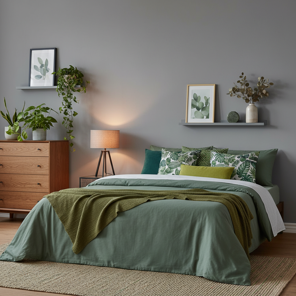
Are Greens and Grays Also Suitable for Sleep?
Green and gray are actually better choices than blue for some people. Green feels grounding in a way blue doesn’t. Gray offers that sophisticated neutral thing without being boring beige.
Sage green has become popular for good reason – it’s calming without being obviously “themed.” Clare Paint’s Current Mood is a perfect example, though at $54 per gallon it’s pricier than Home Depot brands. But the color payoff is better. Pair it with white or cream bedding and some actual plants to lean into the natural vibe.
Olive green works too, especially if your bedroom gets good natural light. It can look muddy in dim rooms though. Test it thoroughly. Seafoam green is lighter and safer but might feel too mint-colored for some people’s taste.
Gray is trickier than people think because the undertones matter so much. Some grays read purple in certain lights. Others go green or blue. Sherwin Williams Agreeable Gray is popular because it stays neutral in most lighting situations. About $45 per gallon at retail.
Light grays like dove gray or that barely-there gray from Benjamin Moore called Classic Gray work well as main colors. Darker grays like charcoal can work as accent walls but use them carefully. Too much dark gray makes a room feel like a cave.
The nice thing about gray is it goes with everything. You can change your bedding colors seasonally without repainting. White bedding looks crisp, cream bedding looks cozy, even soft pink or blue bedding works.
When picking green or gray, pay attention to whether the undertone feels warm or cool. Cool undertones work better in rooms with lots of natural light. Warm undertones help in darker rooms or north-facing bedrooms that don’t get much sun. This approach to sleep-promoting wall colors makes a real difference in how restful your space feels.
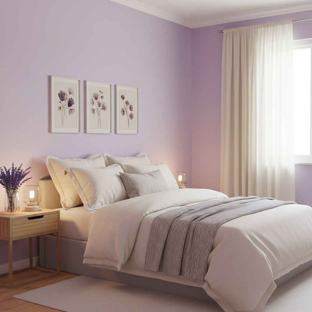
How Can I Use Lavender and Other Muted Tones?
Lavender gets overlooked but it’s genuinely calming. Not bright purple – that soft, faded lavender that looks almost gray in some lights. The association with actual lavender plants probably helps too.
The trick with lavender is keeping it muted enough. Benjamin Moore’s Lavender Ice (affiliate link) is a good example – purple enough to read as color but subtle enough not to overwhelm. Pair it with cream or soft white bedding to keep it from feeling too themed.
Blush pink works similarly. Sounds risky but the right shade is surprisingly versatile and calming. Clare’s Angel’s Share or Farrow & Ball’s Pink Ground both work for this, though Farrow & Ball runs about $100 per gallon. Expensive but the depth of color is noticeably better than cheaper alternatives.
Cream and warm beige aren’t exciting but they create that cozy, wrapped-up feeling some people need for good sleep. Benjamin Moore’s White Dove isn’t technically beige but it’s warm enough to feel cozy while still being light and airy.
These muted tones work especially well if you have colorful art or a bright quilt you want to display. They provide a calm backdrop that lets other elements shine without competing. The key is understanding color temperature and how it affects your circadian rhythm.
The lighting considerations are huge with these colors. Lavender can look weird under cool LED lights – too blue or too gray. Warm white bulbs (2700K) work better than cool white (4000K+). Same with blush pink and cream tones.
Natural elements help sell the whole calming vibe. A few plants, some wood furniture, linen curtains. Nothing too matchy but enough natural texture to keep muted paint colors from feeling flat or boring. This holistic approach to bedroom design creates the perfect environment for relaxing bedroom paint ideas to shine.
Consider seasonal changes too. These softer colors can handle different accent colors throughout the year. Navy blue pillows in winter, sage green in spring, that kind of thing.
Frequently Asked Questions
Q: What if I don’t like blue? Are there other options for promoting sleep?
A: Absolutely. Personal preference trumps color theory every time. If blue makes you feel cold or reminds you of your childhood dentist’s office, it’s not going to help you relax. Green, gray, soft lavender, even warm cream can work just as well. The important part is choosing muted, less saturated versions of whatever color you actually like. A soft sage green bedroom will serve you better than a blue one you find depressing.
Q: How important is the sheen of the paint I choose for my bedroom walls?
A: More important than most people realize. Matte or eggshell finishes absorb light instead of reflecting it, which creates that soft, calm look you want for sleep. Satin or semi-gloss finishes bounce light around and can feel more energizing – fine for kitchens, not ideal for bedrooms. Plus matte hides wall imperfections better, so your room looks smoother and more serene. The downside is matte paint is harder to clean, but bedrooms don’t get as dirty as other rooms anyway.
Q: Does the color of my bedding matter as much as the wall color?
A: Your bedding takes up a huge amount of visual space, so yes, it matters a lot. Think of your walls as the backdrop and your bedding as the main event. They need to work together. If you have soft blue walls, bright orange bedding is going to fight for attention and mess up the calm vibe. Stick with colors in the same family – soft blues, grays, whites, creams. Natural fabrics like cotton and linen also help because the texture adds to the relaxed feeling.