

Tired of the same old kitchen color schemes?
Yup. I’m talking about endless shades of white, gray, and beige that feel safe but sort of boring. A fresh coat of paint, or even just a few colorful accents, can completely transform your space without breaking the bank.
The right colors can make your kitchen feel more inviting, modern, or even larger than it actually is. Maybe you’ve been scrolling through Pinterest for hours, looking at those picture-perfect white farmhouse kitchens, but honestly, they all start to look the same after a while. You might already know how to bring industrial kitchen vibes to your space – if not, click the link and do your homework. In the meantime, let’s explore some unexpected hues that’ll make your friends do a double-take when they walk into your kitchen.
Here are six refreshing colors that are anything but predictable:
- Misty Lilac: Offers a calming and sophisticated alternative to traditional white or gray kitchens
- Deep Teal: Brings drama and luxury, working especially well with natural wood tones
- Mustard Yellow: Adds cheerful energy, perfect for brightening up smaller spaces
- Terracotta: Creates warm, earthy vibes reminiscent of Mediterranean kitchens
- Sage Green: Provides soothing, organic touches that bring the outdoors in
- Blush Pink: Introduces subtle, unexpected pops of color for soft, inviting spaces
These aren’t your grandmother’s avocado green appliances from the 70s. We’re talking about thoughtful, modern takes on color that can work in everything from a tiny apartment galley kitchen to a sprawling open-concept space.
1. Misty Lilac: Serene Sophistication

This light purple hue offers a gentle wash of color that’s both unexpected and incredibly versatile. It works beautifully with stainless steel appliances from brands like KitchenAid or Bosch, and looks amazing against butcher block countertops from IKEA or reclaimed wood from local suppliers.
For a modern touch try pairing misty lilac cabinets with brushed gold hardware, like maybe some sleek pulls from CB2 or West Elm, around $25-40 each. The clean, minimalist lines really let the color shine without feeling overwhelming. Lilac shades are expected to gain even more popularity over the next few years, so you’d be ahead of the curve.
The trick to successfully incorporating misty lilac is balancing it with complementary colors. You might use it as an accent wall against soft white like Benjamin Moore’s Cloud White, or paint your lower cabinets in misty lilac while keeping the uppers neutral. This creates a sense of spaciousness that’s especially helpful in smaller kitchens.
The cool tones can be warmed up with touches of natural wood, maybe a live-edge walnut countertop or some open shelving in warm oak. Copper accents work beautifully too. Think copper pendant lights over your island, around $150-300 each from places like West Elm or Wayfair.
Natural elements like a marble backsplash or wooden cutting boards help balance those cool undertones with warmer textures. The color also plays really well with natural light. If you’ve got big windows, misty lilac practically glows during golden hour.
2. Deep Teal: Dramatic Luxury
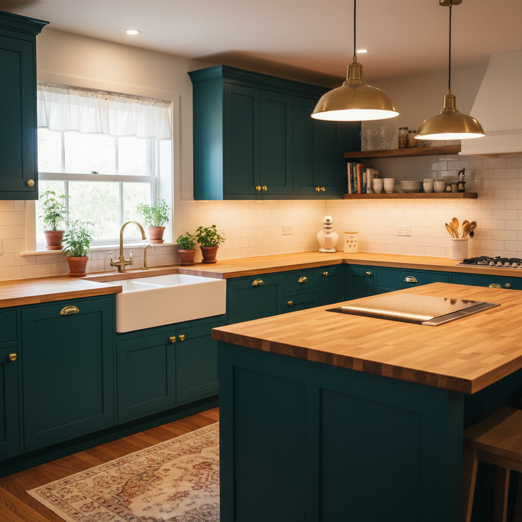
Deep teal is for those who want their kitchen to make a statement. We’re talking about rich, jewel-toned hues like Sherwin-Williams’ Oceanside or Benjamin Moore’s Aegean Teal, colors that feel both bold and sophisticated.
This color adds serious drama and luxury, especially when you’ve got natural wood elements to play with. Picture deep teal cabinets against honey oak floors or a butcher block island from Lumber Liquidators. The contrast between cool teal and warm wood creates this amazing visual tension that’s just stunning.
You don’t have to go all-in with teal everywhere. Maybe just your kitchen island in deep teal, around $800-1200 to paint professionally, while keeping your perimeter cabinets in classic white. Or consider a deep teal backsplash in subway tile from Home Depot, probably around $3-5 per square foot.
To keep the space from feeling too moody, balance that deep teal with lighter colors, crisp whites, warm creams, or soft light grays. Metallic accents in gold or brass really make the teal pop. Think brass cabinet pulls from Anthropologie, around $15-25 each, or a brass faucet from Kohler in their Vibrant Brushed Moderne Brass finish.
A mosaic backsplash in deep teal can serve as your kitchen’s focal point. Pair it with white Carrara marble countertops and white shaker cabinets for that clean, modern look everyone’s after. Or flip it and paint your lower cabinets deep teal and keep the uppers white to maintain that sense of openness.
Jewel tones are having a major moment in kitchen design. People are moving away from all-neutral everything and embracing colors that actually have some personality. Good lighting is crucial though! You’ll want plenty of under-cabinet LED strips, maybe around $50-80 from Amazon, to make sure the teal doesn’t make your space feel like a cave.
Introduce natural textures like woven baskets from Target, around $20-35 each, or thick wooden cutting boards to soften the dramatic color. Plants work wonders too. Get some basic pothos or snake plants that don’t need too much fussing.
3. Mustard Yellow: Cheerful Energy

Mustard yellow might sound intimidating, but let’s really take some time and consider it: a warm, golden hue like sunshine in your kitchen, absolutely perfect for those mornings when you need an extra dose of energy with your coffee.
There are colors like Benjamin Moore’s Hawthorne Yellow or Behr’s Turmeric, not your neon school bus yellows. They’re sophisticated, earthy yellows that feel both retro and totally current. Mustard yellow is especially great for smaller kitchens or spaces that don’t get tons of natural light. It literally brightens everything up.
You can go big with mustard yellow cabinets, but that’s probably a commitment you want to think through. Maybe start with a mustard yellow island, painting costs around $400-600 depending on size. Or try a cheerful backsplash in handmade subway tiles, around $8-12 per square foot from places like Fireclay Tile.
Balance is everything with mustard yellow. Pair it with crisp whites, soft grays, or even bold black for a really modern look. White quartz countertops from brands like Caesarstone, around $60-80 per square foot installed, look amazing against mustard yellow cabinets.
The color actually pairs surprisingly well with other bold hues too. Navy blue creates this gorgeous vintage-inspired combination; imagine mustard yellow uppers with navy lowers, or vice versa. Emerald green accessories bring in that 70s Palm Springs vibe that’s everywhere right now.
Different shades of mustard yellow create totally different moods. A lighter, more muted version feels subtle and sophisticated, which is perfect if you’re testing the waters. A bolder, more vibrant shade adds playful energy that’s hard to ignore.
Don’t be afraid to use mustard yellow in unexpected places. Paint the inside of your pantry for a fun surprise, around $50 in paint costs. Or try it on window trim to frame your kitchen views. Color psychology tends to suggest that yellow can actually boost happiness and creativity. That’s not a bad thing when you’re cooking dinner after a long day.
Vintage-inspired appliances really enhance the retro feel. Maybe a mustard yellow KitchenAid stand mixer, around $300-400, or some colorful ceramic canisters from CB2. Add plenty of greenery, like an herb gardens on your windowsill or some trailing pothos, to soften all that bold color.
4. Terracotta: Earthy Warmth

Terracotta is having this incredible moment right now, and honestly, it’s about time. This warm, earthy color brings serious Mediterranean charm to any kitchen, evoking sun-baked clay pots and those gorgeous Italian countryside homes you see on Instagram.
Colors like Sherwin-Williams’ Cavern Clay or Benjamin Moore’s Sedona Clay capture that perfect terracotta vibe without feeling too intense. The color works particularly well if you’re going for rustic or farmhouse vibes, but it can definitely work in more modern spaces too.
Terracotta walls create this amazing backdrop for white or natural wood cabinets. Paint costs are typically around $400-800 for an average kitchen, depending on prep work needed. Or try terracotta floor tiles. There are some ceramic options from places like Home Depot run around $2-6 per square foot, while higher-end options from specialty tile shops can go $10-20 per square foot.
Natural materials are terracotta’s best friends. Think butcher block countertops, maybe around $40-100 per square foot, stone backsplashes, and linen Roman shades. These textures enhance the warmth and make everything feel authentic rather than theme-y.
The color pairs beautifully with olive green dish towels from Crate & Barrel, ochre-colored pottery, or beige linen napkins. You can also add pops of brighter colors like vibrant blues or emerald greens for contrast.
Different textures of terracotta create different vibes entirely. A smooth terracotta paint finish feels elegant and refined, while textured terracotta tiles add visual interest and depth. Maybe try a terracotta tile backsplash with some texture to catch the light and add some dimension.
Research suggests that earth-toned kitchens create a sense of calm and groundedness. There’s something about terracotta that makes people want to linger, to actually cook instead of just heating up takeout.
Plants are absolutely essential with terracotta. Herbs in small terracotta pots, around $8-15 each from local nurseries, enhance that natural, organic feel. You’ll want basil, rosemary, thyme – things you’ll actually use in your cooking.
Copper accents work perfectly too. Copper pendant lights, around $200-500 each, or copper cookware displayed on open shelves add warmth and shine that complements the earthy terracotta beautifully.
5. Sage Green: Soothing Organic

Sage green has become the ultimate calming color for kitchens, and it’s not hard to see why. This soft, muted green feels like bringing a piece of nature indoors, which is literally perfect if you’re trying to create that serene, spa-like atmosphere everyone’s craving these days.
Colors like Benjamin Moore’s Sage Wisdom or Sherwin-Williams’ Clary Sage capture that perfect balance between green and gray. The color works beautifully in everything from modern minimalist kitchens to traditional farmhouse spaces. It’s versatile enough to feel timeless rather than trendy.
Sage green cabinets are probably the most popular way to use this color. Professional cabinet painting typically runs $1200-3000 depending on your kitchen size and existing cabinet condition. The color looks amazing against white quartz countertops or natural wood. Maybe some butcher block from IKEA’s HAMMARP series, this is around $189 for 8 feet.
Natural materials really enhance sage green’s organic feel. Stone backsplashes, linen Roman shades from brands like The Shade Store, and woven baskets for storage all complement the color beautifully. The idea is to create this harmonious, nature-inspired atmosphere.
The color pairs wonderfully with other earthy tones. Cream subway tiles, beige area rugs from West Elm, warm brown leather bar stools, everything just flows together naturally. You can also add brighter pops with mustard yellow accessories or coral-colored ceramics.
Different shades create different moods entirely. Lighter sage greens feel bright and airy, absolutely perfect for smaller kitchens or spaces with limited natural light. Darker sage greens add depth and sophistication, working beautifully in larger kitchens with plenty of windows.
Interior design experts consistently recommend sage green for its ability to work with almost anything. It’s like the perfect neutral that actually has some personality. The color photographs beautifully too, which doesn’t hurt if you’re planning to sell your home eventually.
Live plants are almost mandatory with sage green. Herb gardens on your windowsill, maybe some basil and mint in small pots from your local nursery, around $5-8 each. Trailing plants like philodendron or our old pal pothos add life and movement to the space.
Natural wood countertops work perfectly with sage green. Live-edge walnut or warm oak creates this beautiful contrast between the cool green and warm wood tones. Even bamboo cutting boards and wooden utensil holders enhance that natural, organic feeling you’re going for. Learn more about why and how certain color combos can inspire certain feelings.
6. Blush Pink: Unexpected Softness

Blush pink in the kitchen might sound scary, but this soft, sophisticated color is surprisingly versatile and totally unexpected in the best way possible. We’re talking about colors like Benjamin Moore’s First Light or Sherwin-Williams’ Intimate White with pink undertones – nothing Barbie-esque here. All due respect to Barbie, of course.
This delicate hue adds femininity and sophistication without being overwhelming. It works particularly well in modern or minimalist kitchens where clean lines let the color shine. The trick is treating blush pink like a neutral rather than a bold statement color.
Blush pink cabinets create this amazing focal point that’s soft yet distinctive. Cabinet painting typically costs $1200-2500 depending on your kitchen size. The color looks gorgeous against white marble countertops. Maybe Carrara marble, around $60-100 per square foot installed, or white quartz for something more budget-friendly.
Balance is crucial with blush pink. Incorporate contrasting colors like charcoal gray, crisp white, or even black hardware to add sophistication and prevent the space from feeling too sweet. Matte black cabinet pulls from CB2, around $15-25 each, create this beautiful contrast against soft pink cabinets.
Metallic accents really elevate blush pink. Gold or rose gold hardware adds glamour without being flashy. Think brushed gold faucets from Kohler, around $200-400, or gold pendant lights from West Elm, around $150-300 each. The warm metals complement the soft pink beautifully.
Different shades create entirely different moods. Lighter blush pinks feel bright and airy, which is perfect for smaller kitchens or spaces that need more light. Deeper blush pinks add drama and sophistication, working beautifully as accent colors rather than main colors.
The color pairs surprisingly well with other pastels for a more playful approach, or with deeper jewel tones for something more sophisticated. Navy blue and blush pink create this amazing preppy, classic combination that feels both timeless and current.
White marble countertops and backsplashes feel luxurious against blush pink cabinets. The veining in the marble adds visual interest while keeping the overall palette soft and elegant. Even white subway tiles, around $1-3 per square foot from Home Depot, work beautifully as a backdrop.
Plants soften the look and bring in natural elements that ground the pink. Maybe some trailing ivy or a few small succulents in white ceramic pots from Target, around $10-20 each. The greenery creates this beautiful contrast against the soft pink that feels fresh and natural.
Intrigued by pink? Immerse yourself in our deep dive on using different shades of the color tastefully throughout your home. Otherwise, for more kitchen layout inspiration, check out our guide to efficient kitchen layouts