When you purchase through links on our site, we may earn an affiliate commission.
KEY TAKEAWAY
While white walls define a room, moody paint colors blur the boundaries, creating a cocoon effect that reduces overstimulation.
Most people think a dark room is about hiding things: clutter, bad floors, whatever. But truthfully, I think a moody space is sometimes the only place where you can finally be seen by yourself. While the world continues to praise “light and airy” minimalism, many of us are finding that those sterile, white-box rooms feel a bit like a white flag of surrender. They are loud. They are demanding. They require a level of “perfect” that the human nervous system wasn’t designed to maintain 24/7.
If your home currently feels like a distraction instead of a sanctuary, it might be because your walls lack the depth they need to help you truly power down. Design is a form of emotional restoration. By leaning into saturated, moody pigments, we aren’t just decorating; we are architecture-ing a quiet reset for the soul.
Here are five rich alternatives to black that provide a healing backdrop for a life lived with intention:
1. Midnight Teal: The Weightless Ocean
There is a specific kind of stillness found at the bottom of the ocean. Midnight Teal captures that sense of “weightless” immersion. According to color therapists as noted by Healthline, deep blues are scientifically linked to lower heart rates and increased feelings of tranquility.
- The Healing Impact: This hue acts as a visual mute button for the overstimulated mind.
- Styling Tip: Pair this with warm brass accents. The “glimmer” against the deep teal ensures the room feels like a treasure chest rather than a cave.
- Steal This Look:
- Decor: Check out these stylish brass floor lamps with metal shades from Amazon.
- Paint: Make your room a deep blue with this teal from Benjamin Moore, to capture that meditative peace.
2. Conservatory Green: The Indoor Forest
Biophilic design, the practice of bringing nature indoors, is a trendy buzzword I know, but it’s also a biological necessity. Research published in the journal Nature suggests that even visual exposure to green environments can significantly reduce cortisol levels.
- The Healing Impact: Conservatory Green brings the stillness of an ancient forest into your home, grounding your energy after a day of digital chaos.
- Styling Tip: Ground this pigment with raw wood elements and oversized linen textures.
- Steal This Look:
- Decor: Add these large indoor planters from Amazon to bring a natural element to your room.
- Paint: The Dragonfly Green from Benjamin Moore gives your room a rich, lush, natural appearance.
3. Smoked Aubergine: The Sophisticated Cocoon
If you want a room that feels like a hug, Smoked Aubergine is the answer. This isn’t the bright purple of a child’s bedroom; it is a dusty, blackened plum that feels incredibly regal.
- The Healing Impact: This color encourages introspection and creativity. It is the perfect choice for a “cozy study corner“.
- Styling Tip: Use velvet curtains in a matching shade to create a “cocoon” effect that absorbs outside noise and light.
- Steal This Look:
- Decor: Try these lush, velvet noise and sound-blocking curtains styled by NICETOWN to add an element of peaceful strength to a room.
- Paint: This regal aubergine Eggplant from Benjamin Moore is a thoughtful and powerful vibe in any room.
4. Iron Ore: The Modern Anchor
For those who loved our 6 Velvety Black Walls That Transform Rooms but want something slightly softer, Iron Ore is the ultimate transitional charcoal. It has enough gray to feel architectural and enough warmth to keep it from feeling cold.
- The Healing Impact: It provides a sense of “stability” and “strength.” It is an excellent choice for an entryway, serving as a decompression chamber as you step inside.
- Styling Tip: Contrast this with light oak flooring to keep the space feeling modern and balanced.
- Steal This Look:
- Decor: I recommend trying a minimalist entryway bench that you can use for more than one purpose.
- Paint: The Wrought Iron from Benjamin Moore gives you that stability we talked about, but it’s still incredibly ‘soft’, considering the depth of the hue.
5. Burnt Terracotta: The Earthbound Glow
While there are certainly a ton of moody colors that are “cool,” Burnt Terracotta is incredibly “warm.” It mimics the glow of a sunset or a dying fire, signaling to the brain that it is safe to rest.
- The Healing Impact: This is the color of “belonging.” It is particularly effective in spaces where you gather, like those 10 Tiny Dining Corners our community is currently obsessed with.
- Styling Tip: Keep the lighting low and warm (around 2700K) to bring out the earthy “glow” of the pigment.
- Steal This Look:
- Decor: A dining table with a natural wood tone can add this natural warmth to a space.
- Paint The Terra Cotta Tile from Benjamin Moore is dramatic but welcoming with its fiery glow.
The Final Reset
A beautiful home isn’t one that looks like a magazine. beautiful home. It’s one that heals you before you even realize you need it. Stop decorating for the “likes” of strangers and start designing for your own soul. Whether you choose the depth of a Midnight Teal or the warmth of a Terracotta, remember that the boldest move you can make is choosing a color that makes you feel at home.
Frequently Asked Questions
Q: Will painting a small room a dark color make it feel smaller?
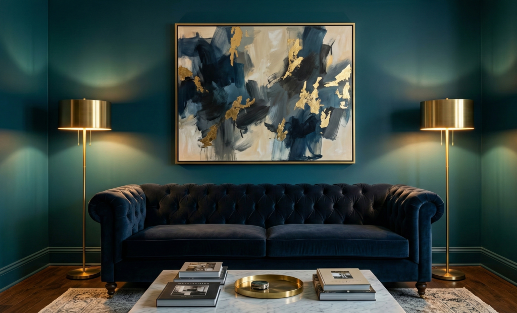
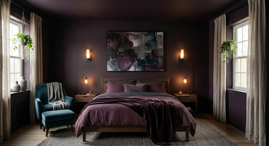
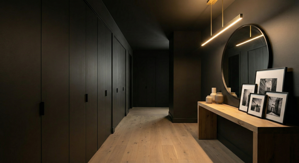
A: Actually, the opposite is often true. While white walls define the boundaries of a room, moody paint colors like Smoked Aubergine or Midnight Teal tend to blur them. When you paint the walls and the ceiling the same saturated color, you create a “cocoon” effect that makes the corners of the room disappear. This gives the illusion of an infinite, expansive space rather than a cramped one. It turns a “tiny room” into a purposeful sanctuary.
Q: I love the moody aesthetic but I am nervous about it feeling too heavy. How can I find a balance?
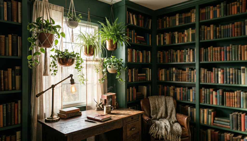
A: The balance is found in the “Glimmer and Ground” technique. You must introduce elements that catch the light against the dark backdrop. This is why I suggest brass accents for Midnight Teal or light oak flooring for Iron Ore. These highlights provide visual relief and keep the room feeling sophisticated rather than somber. Additionally, bringing in biophilic elements like hanging plants adds a “healing” energy that breathes life into the shadows.
Q: How do I know which “moody” hue is right for my specific needs?
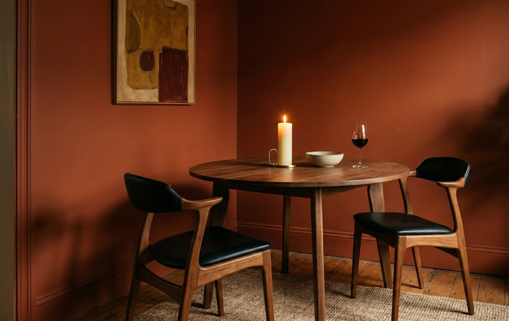
A: Listen to what your nervous system is asking for. If you feel overstimulated and need to power down, the cool depths of Midnight Teal or Conservatory Green act as a visual reset. If you feel lonely or cold and need a sense of belonging, the “Earthbound Glow” of Burnt Terracotta provides grounded warmth. Choose the color that provides the emotional restoration you are currently missing in your daily life.

