

Color block walls work. They’re one of those design moves that sounds trendy but actually delivers on the promise. Paint some geometric shapes on your wall and suddenly the whole room feels more intentional, brighter, more you.
I’ve seen beige rental apartments transform into spaces people actually want to hang out in, just from one accent wall done right. The effect is immediate. Walk into a room with thoughtful color blocking and your brain registers it as more interesting, more put-together, sometimes even bigger than it actually is.
- Instant room personality: Color blocking adds character without major renovations or furniture purchases
- Light amplification: Strategic color placement can make rooms feel naturally brighter and more open
- DIY-friendly project: Basic painting skills and weekend time commitment, not contractor territory
- Budget refresh: Transform a space for under $100 in most cases
- Flexible design: Easy to paint over or modify when your taste changes
What Colors Work Best for Color Block Walls?
Color theory matters here, but not in an art school way. More like understanding that certain combinations make your brain happy and others make you feel vaguely anxious every time you walk into the room.

Yellows and warm whites are reliable for making spaces feel brighter. Benjamin Moore’s Hawthorne Yellow or Behr’s Butter Cookie both work without being aggressive about it. This interior design approach pairs beautifully with crisp whites or soft grays. Target sells sample pots for around $3 each, which is perfect for testing combinations on your actual wall.
Blues feel calming but can read cold in rooms without much natural light. Sherwin Williams’ Naval is popular right now, though it’s basically black in dim spaces. Something like their Misty or IKEA’s light blue works better for most people’s actual living situations when creating modern accent walls.
The mistake people make is choosing colors in good lighting at Home Depot, then wondering why everything looks muddy at home. Paint those sample squares and look at them morning, noon, and evening. Your north-facing bedroom and your south-facing kitchen are completely different environments.
Pastels photograph well for Instagram but can feel washed out in person. Sage green looks sophisticated online and sometimes bland on your wall. Terracotta is having a moment in home styling, though it’s tricky to live with long-term.
For color blocking specifically, you want enough contrast that the shapes actually read as separate blocks, but not so much that it feels like a children’s playroom. Two to three colors maximum. Cream, soft peach, and white work. Navy, bright yellow, and hot pink probably don’t, unless that’s genuinely your vibe.
The 60-30-10 rule applies here. Your main wall color should dominate, accent colors should support, not compete. Most successful color block wall designs I’ve seen use one bold color, one neutral, and sometimes a third that bridges the two.
How Do You Plan a Color Block Wall Design?
Measure first. Sounds obvious, but people eyeball this and end up with wonky proportions that look amateurish. An 8-foot ceiling with 12-inch color blocks feels busy. Same ceiling with 24-inch or 36-inch blocks feels more intentional.
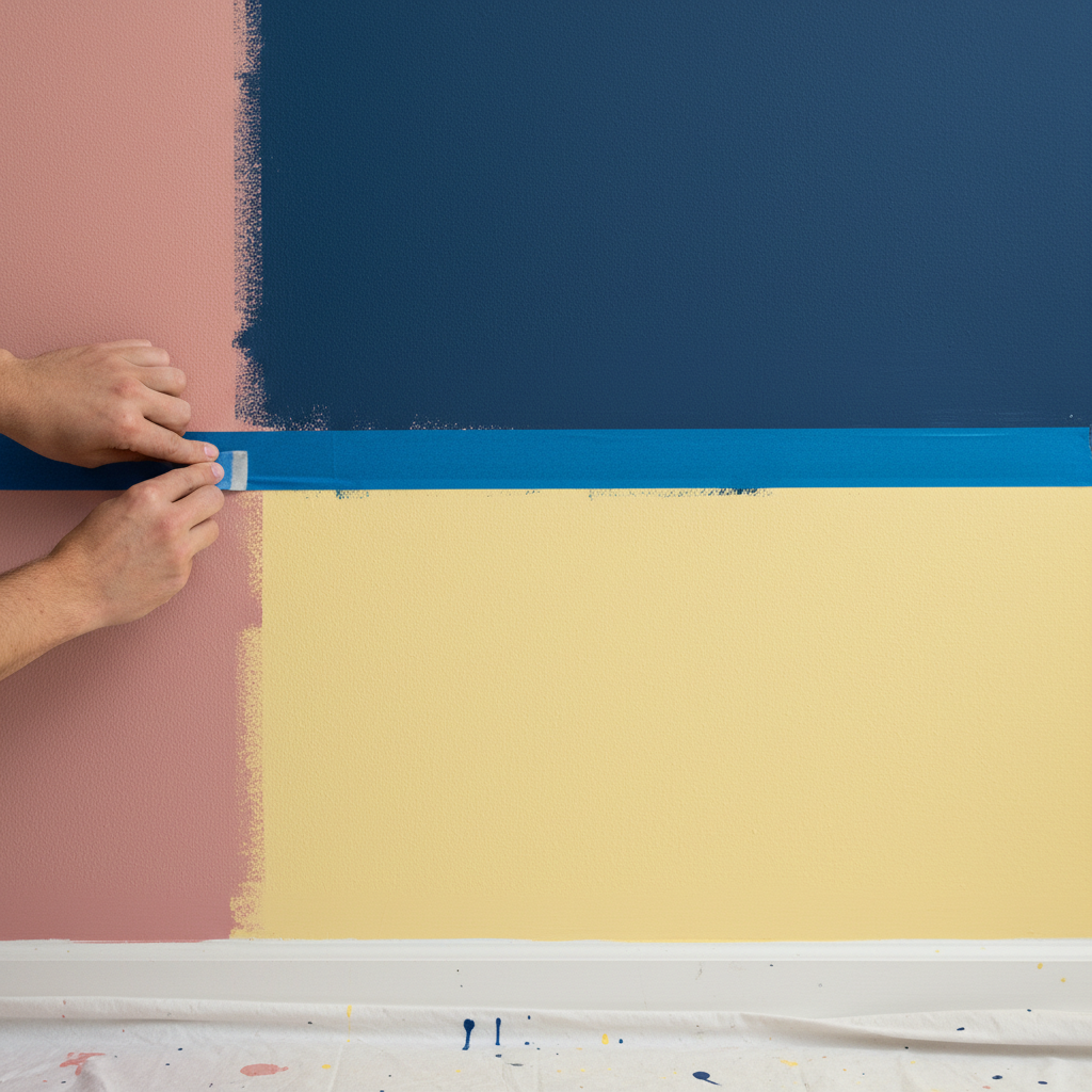
Use painter’s tape to mock up your design before buying paint. The blue tape from 3M costs maybe $8 but saves you from repainting mistakes. Stick it up, live with it for a day or two. Take photos from different angles. Your sofa might block part of the design, or the proportions might feel off once you see the whole thing.
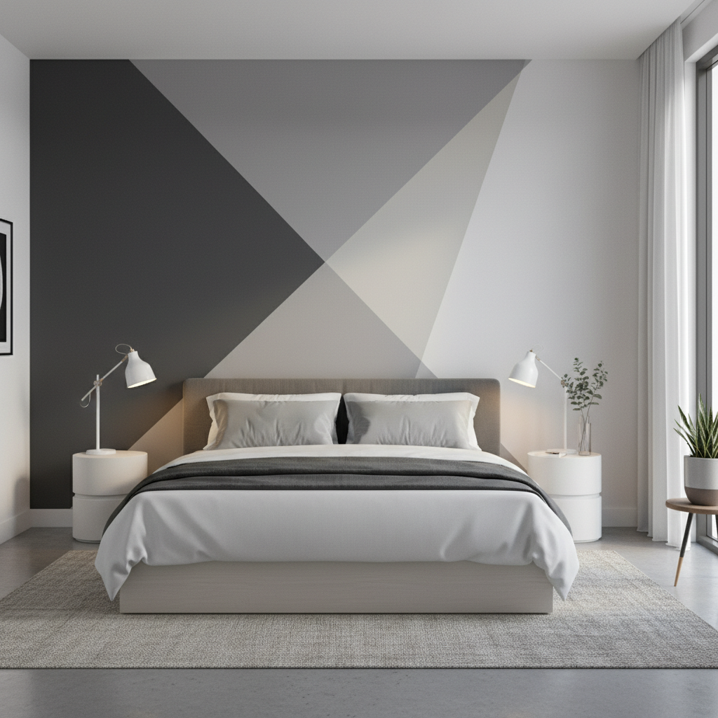
Geometric patterns are easiest for beginners. Rectangles and squares are forgiving. Circles and curved shapes require more precision and honestly, more skill than most DIYers have. Pinterest is full of beautiful organic color block designs that look simple but aren’t.
Consider your furniture arrangement when planning color blocking walls for small spaces. A color block wall behind a sofa can define the seating area nicely. But if you’re planning to rearrange later, keep the design flexible. Bold blocks work well behind beds as fake headboards. Less successful when they’re competing with gallery walls or busy bookshelves.
Room architecture matters too. High ceilings can handle bigger, bolder blocks. Standard 8-foot ceilings look better with horizontal rectangles that don’t emphasize the height limitation. Narrow rooms benefit from horizontal designs that create width illusion.
Scale the design to your space. What works in a 200-square-foot studio apartment won’t work in a 20×15 living room. Bigger rooms can handle more complex patterns, more colors, larger blocks.
What Tools and Materials Are Needed for Color Blocking?
You need better painter’s tape than you think. The cheap stuff bleeds, peels your existing paint, or leaves residue. FrogTape or 3M ScotchBlue costs a few dollars more but actually works. Budget around $15-20 for tape depending on your design complexity.
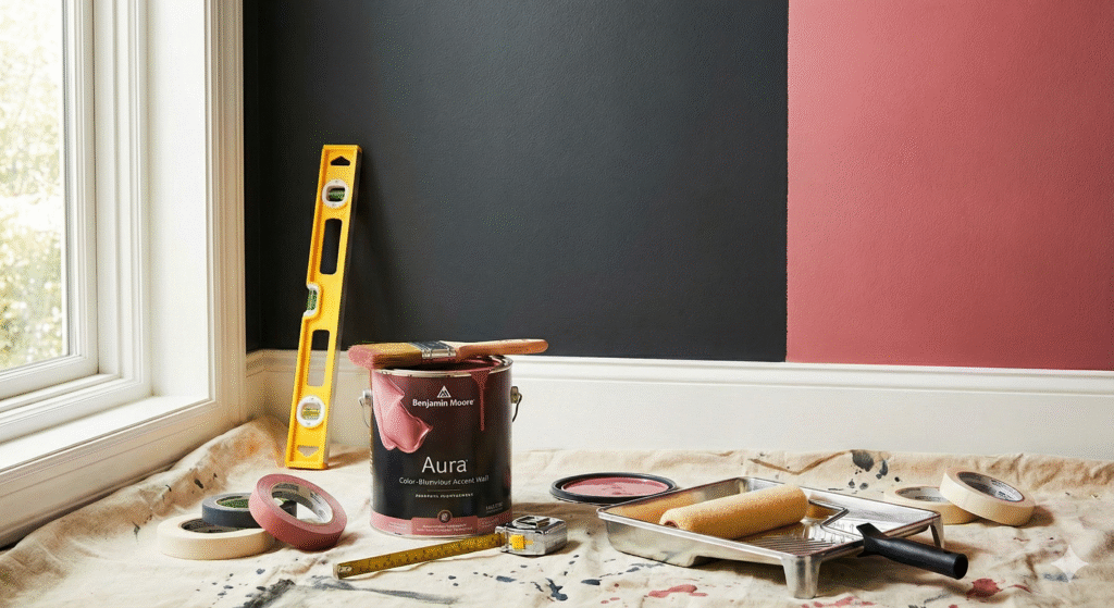
Quality paint matters for color blocking because you’re creating hard edges where colors meet. Cheap paint often has coverage issues that show up most at transitions. Sherwin Williams Duration or Benjamin Moore Aura are worth the extra cost, around $55-65 per gallon versus $35 for basic paint.
Get the right roller nap for your wall texture. Smooth walls need 1/4-inch nap, textured walls need 3/8-inch. Using the wrong roller creates uneven coverage that’s really obvious in color block designs. A good roller cover costs maybe $8.
Brushes for cutting in around tape edges. Purdy or Wooster 2.5-inch angled brushes run about $15 but hold more paint and create cleaner lines than cheaper options. You’ll use this brush for every edge, so it’s worth getting a good one.
Drop cloths, please. The canvas ones from Lowe’s are around $12 and reusable. Plastic is cheaper but tears easily and gets slippery with paint drips.
Level and measuring tape are essential. A $10 level from Home Depot works fine for most walls. Crooked lines kill the whole effect, and your eye will always notice them even if nobody else does.
Primer if you’re going from dark to light colors or covering existing bold colors. Zinsser Bulls Eye 1-2-3 costs about $35 per gallon and prevents color bleed-through issues.
Total material cost for a typical accent wall runs $80-150 depending on paint quality and design complexity. More if you need multiple colors or premium paint brands. This budget-friendly room makeover approach beats most other decorative accents in terms of visual impact per dollar spent.
What Are Some Creative Color Block Wall Ideas?
Ombre blocks work better than solid color transitions for most people’s skill level. Graduate from white to sage green across four or five rectangles. Still gets the gradient effect without the precise blending that true ombre requires.
The fake headboard approach works well in rentals where you can’t install actual headboards. Paint a large rectangle or geometric shape behind the bed. West Elm sells this look with removable wallpaper for $89, but paint costs maybe $25 and looks more custom.
Half-wall color blocking is less commitment than full walls. Paint the bottom third of the wall in a bold color, keep the upper portion neutral. Adds interest without overwhelming the space. Works especially well in dining rooms or hallways.
Asymmetrical designs can look sophisticated if you plan them carefully. Uneven rectangles, varied sizes, off-center placement. But this requires more design confidence. Safe approach is starting with symmetrical patterns and getting more adventurous later.
Color blocking around built-ins or architectural features highlights them instead of trying to hide them. Paint different colored blocks around a fireplace, or use color to emphasize interesting window shapes. This technique works particularly well for easy bedroom wall decorating projects.
Kitchen backsplash areas work well for smaller color block experiments. Less paint required, easier to change if you don’t love it. Pair with white subway tile or simple cabinets to keep it from feeling too busy.
Bathroom accent walls behind vanities are good starter projects. Small space, usually good lighting, contained area if it doesn’t work out. Avoid super bold colors in windowless bathrooms though. Simple living room color schemes translate well to bathroom spaces when you keep the palette restrained.
The gallery wall effect uses color blocks as background for artwork. Paint different colored rectangles, hang pieces within each block. Creates organization for art collections and adds color even when the art is black and white. This room aesthetics approach works especially well for rental-friendly wall decor that doesn’t require permanent fixtures.
Frequently Asked Questions About Color Block Walls
Q: How do I choose the right colors for my color block wall?
A: Start with your existing stuff. What colors are already in the room through furniture, rugs, or art? Build from there instead of starting from scratch. The color wheel thing works, but honestly, trusting your eye and testing samples works better for most people.
Paint samples in different lighting throughout the day. That sage green might look perfect at 2 PM and terrible under evening lighting. Live with the samples for at least a few days before committing to gallons of paint.
Consider the room’s purpose. Energizing colors like coral or bright yellow work well in kitchens or home offices. Calming blues and greens make more sense in bedrooms – we have guides on both blue rooms and green rooms. Don’t put stimulating colors where you’re trying to relax.
Q: What’s the best way to ensure crisp lines when color blocking?
A: Remove the tape while the paint is still slightly tacky, not completely dry. This prevents the paint from bonding to the tape and peeling off when you remove it.
Press the tape edges down firmly with a putty knife or your fingernail. Any gaps will allow paint to bleed underneath. Take time with this step because fixing bleeds later is more work than preventing them.
Paint over the tape edge with your base color first, then apply your accent color. This seals any small gaps and ensures the accent color doesn’t bleed through.
Use a sharp utility knife to score the tape edge before removing it if the paint has dried completely. This prevents paint from pulling up with the tape.
Q: Can I use color blocking in a small room to make it look bigger?
A: Horizontal rectangles can make narrow rooms feel wider. Vertical blocks can add height to rooms with low ceilings. But avoid complex patterns in small spaces because they can feel overwhelming.
Lighter colors on the upper portion of walls create height illusion. Darker colors on the bottom third of walls can ground the space without making it feel smaller.
Keep the design simple in small rooms. Two colors maximum, clean geometric shapes, plenty of negative space. Busy patterns make small rooms feel cramped regardless of color choice.