

Blush pink has quietly become the grown-up answer to millennial pink. It’s warmer, more sophisticated, and doesn’t scream Instagram trend quite as loudly. Plus it works in spaces where full-on pink would feel too aggressive. These blush decor ideas prove that subtle color choices can transform any room.
The shade sits somewhere between dusty rose and barely-there pink. Think of it as the color equivalent of good lighting – flattering on almost everyone and everything. Your grandmother’s rose-colored glasses, but make it chic.
Here are six ways to work blush into your space without turning your living room into a cotton candy machine:
- Blush Walls: Paint that actually makes a room feel bigger and cozier at once
- Blush Furniture: Statement pieces that don’t overwhelm smaller spaces
- Blush Textiles: The easiest way to test-drive the color before committing
- Blush Accessories: Small touches that add warmth without the renovation
- Blush and Gold Accents: The color combo that photographers love for good reason
- Blush in the Bedroom: Where this shade really shines
1. Blush Walls: A Serene and Stylish Backdrop
Painting walls blush feels like a risk until you actually do it. Then you realize why high-end hotels use this trick constantly.
The shade works because it’s warm without being aggressive. Benjamin Moore’s First Light or Sherwin Williams’ Touching Pink both land in that sweet spot. Around $60 per gallon, which isn’t cheap but you’re looking at two gallons max for an average bedroom.
Test the color first though. Paint changes dramatically throughout the day. That soft morning glow might read more intense under evening lamplight. I learned this the hard way in a north-facing bathroom where the “subtle blush” turned into what my partner called “Pepto pink” after sunset.
Natural light brings out the best in blush walls. Southern exposure makes it glow. Northern rooms can handle slightly warmer undertones. East and west-facing spaces are trickier – the color shifts as the sun moves.
Matte finish gives you that expensive-looking flat surface that photographs beautifully. Eggshell works if you need something more washable, especially in bedrooms where kids might leave fingerprints. Skip the satin unless you’re dealing with a bathroom situation.
The magic happens when you pair blush walls with crisp white trim. Crown molding, baseboards, door frames – all white. It creates this clean contrast that keeps the room from feeling too precious. Like good editing, the white trim makes everything else look intentional.
Neutral furniture becomes more interesting against blush walls. That IKEA Hemnes dresser you bought in white suddenly looks curated. Your Target throw pillows seem more expensive. This color palette acts like a flattering filter for everything else in the room.
2. Blush Furniture: A Focal Point of Soft Elegance
Blush furniture is where you either commit or you don’t. There’s no halfway with a $1,200 West Elm velvet sofa in dusty rose.
But if you’re going to do it, velvet is the way. The texture makes the color feel luxurious instead of nursery-sweet. Article’s Sven sofa comes in a shade called Rose Pink that’s actually sophisticated. Around $1,400 for a three-seater, which is reasonable for solid construction.
Smaller pieces are less commitment. A blush accent chair from Target’s Project 62 line runs about $300. The Opalhouse collection usually has at least one blush option, though the quality varies. You get what you pay for with upholstered furniture.
Linen works too, especially in more casual spaces. The slightly rumpled texture of linen keeps blush from looking too formal. CB2’s movie chair in blush linen is around $400 and holds up well if you’re not expecting Restoration Hardware quality.
Scale matters more with colored furniture than neutral pieces. A huge blush sectional can overwhelm a room. Better to go with a smaller sofa and add blush through other elements when decorating on a budget. Or flip it – one statement piece in blush, everything else neutral.
Pair blush furniture with brass or warm gold hardware. The combination feels current without being trendy. Chrome looks cold against the warmth of blush. Black works but can feel stark. Brass just works.
Throw pillows in cream, taupe, or soft gray keep blush furniture from looking too matchy. Texture helps too – a chunky knit throw, maybe in oatmeal or mushroom. The goal is to ground the sweetness with something more neutral through thoughtful furniture arrangement.
3. Blush Textiles: Layering Warmth and Texture
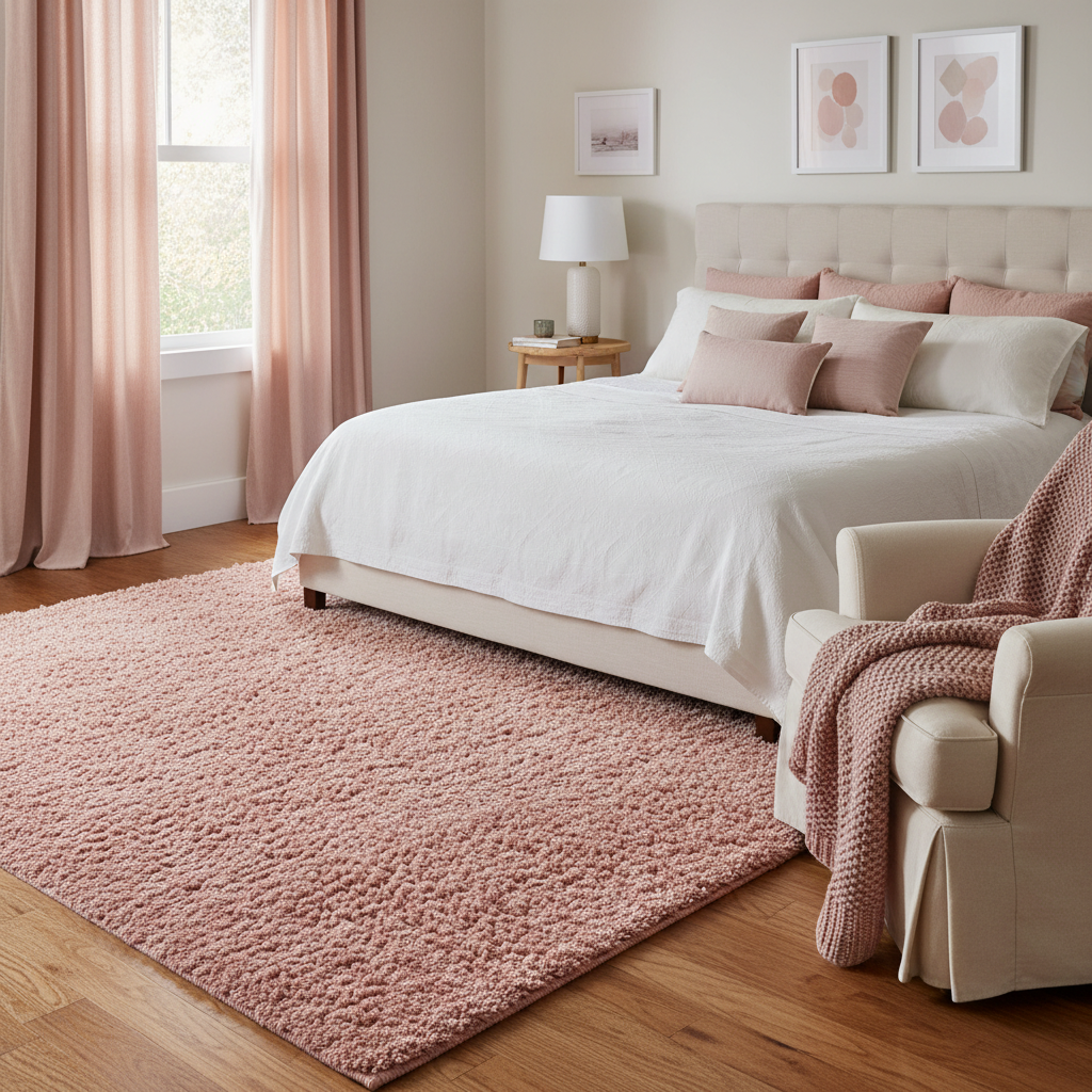
Textiles are the training wheels of home styling with blush. You can try the color without painting walls or buying expensive furniture.
Start with a rug. Rugs USA has decent options around $150 for an 8×10. The quality isn’t heirloom-level but it’s fine for testing whether you actually like living with blush. Loloi makes prettier ones if you want to invest more, around $400-600.
Curtains in blush linen transform a room’s whole feeling. IKEA’s Majgull curtains come in a dusty rose that’s surprisingly sophisticated for $25 a pair. West Elm’s linen ones are nicer but run $80-120 depending on length. The IKEA ones work fine if you steam them first to get the factory creases out.
Throw blankets are the easiest test. Anthropologie usually has a few blush options around $100-150. H&M Home’s throws are hit or miss on quality but only $30-40. Target’s Threshold line often includes blush in their seasonal collections.
Mix textures when you’re layering blush textiles. A smooth cotton duvet cover with a chunky knit throw. Linen curtains with a jute rug that has blush accents. The variation keeps everything from looking flat and creates better room aesthetics.
Don’t do all blush textiles in one room. It’s too much of the same tone. Better to have one major blush textile – maybe curtains – then smaller hits in pillows or a throw when creating a cozy bedroom setup. The room needs breathing space.
Blush works surprisingly well with patterns. Stripes, especially in cream and blush, feel fresh. Small florals work if they’re not too precious. Even some geometric patterns work, though you have to be careful not to veer into little-girl territory.
4. Blush Accessories: Accent with Decorative Items

Decorative accents in blush get fun without getting expensive. You’re talking $15-50 per item instead of hundreds.
Vases are probably the easiest place to start. CB2 always has a few blush ceramic options around $25-40. Fill them with white flowers – peonies when they’re in season, white roses otherwise. The contrast is prettier than matching pink flowers, which can look too coordinated.
Candles in blush holders add warmth without being permanent. Anthropologie’s candle selection includes blush options, usually $20-35. Diptyque occasionally does limited edition blush vessels if you want to spend $70 on a candle, which some people do.
Picture frames in blush or rose gold tie everything together. Target’s Brightroom line has decent options under $20. For something nicer, CB2’s brass frames with a rose gold finish run $30-60 depending on size.
Books with blush spines exist if you look for them. Art books often have soft-colored covers that work. Coffee table books about fashion, flowers, or travel tend to have more interesting spines than bright primary colors.
Sculptural objects in blush add interest to shelves. A ceramic bowl, maybe a small decorative sphere. West Elm’s accessory selection rotates seasonally but usually includes some blush pieces. Around $20-80 depending on size and material.
The trick with blush accessories is restraint when styling small spaces. Three blush items grouped together looks intentional. Seven blush items scattered around looks like you have a problem. Cluster them or space them way out.
5. Blush and Gold Accents: Chic Sophistication
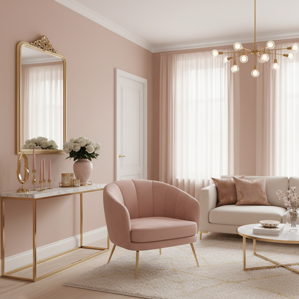
Blush and gold together is why this color combination shows up in every high-end design magazine. The metals warm up the pink and the pink softens the metals.
Start with hardware. Gold cabinet pulls, gold picture frames, gold table legs. These small touches add up to a cohesive look. CB2’s brass hardware runs $8-25 per piece. More expensive than basic silver but the warmth is worth it.
Mirrors with gold frames reflect light and make blush walls glow. West Elm has several options around $150-300. IKEA’s Songe mirror is $50 and perfectly fine if you’re not looking for an heirloom piece. The brass finish isn’t as rich as pricier options but it works.
Gold-legged furniture anchors the combination. A blush chair with brass legs, maybe a marble-top side table with gold supports. The contrast between soft color and hard metal creates visual interest.
Lighting matters here. Brass pendant lights or table lamps with warm bulbs enhance both the blush and gold elements. Cool LED bulbs make everything look cheap. Warm incandescent or warm LED brings out the richness in both colors.
Don’t go overboard with the gold. Too much and it looks like a jewelry store exploded. The ratio should lean toward blush with gold as the accent, not fifty-fifty. Think gold touches, not gold takeover.
Rose gold splits the difference if regular gold feels too yellow. It has pink undertones that play nicely with blush. Anthropologie uses this combination constantly in their home section.
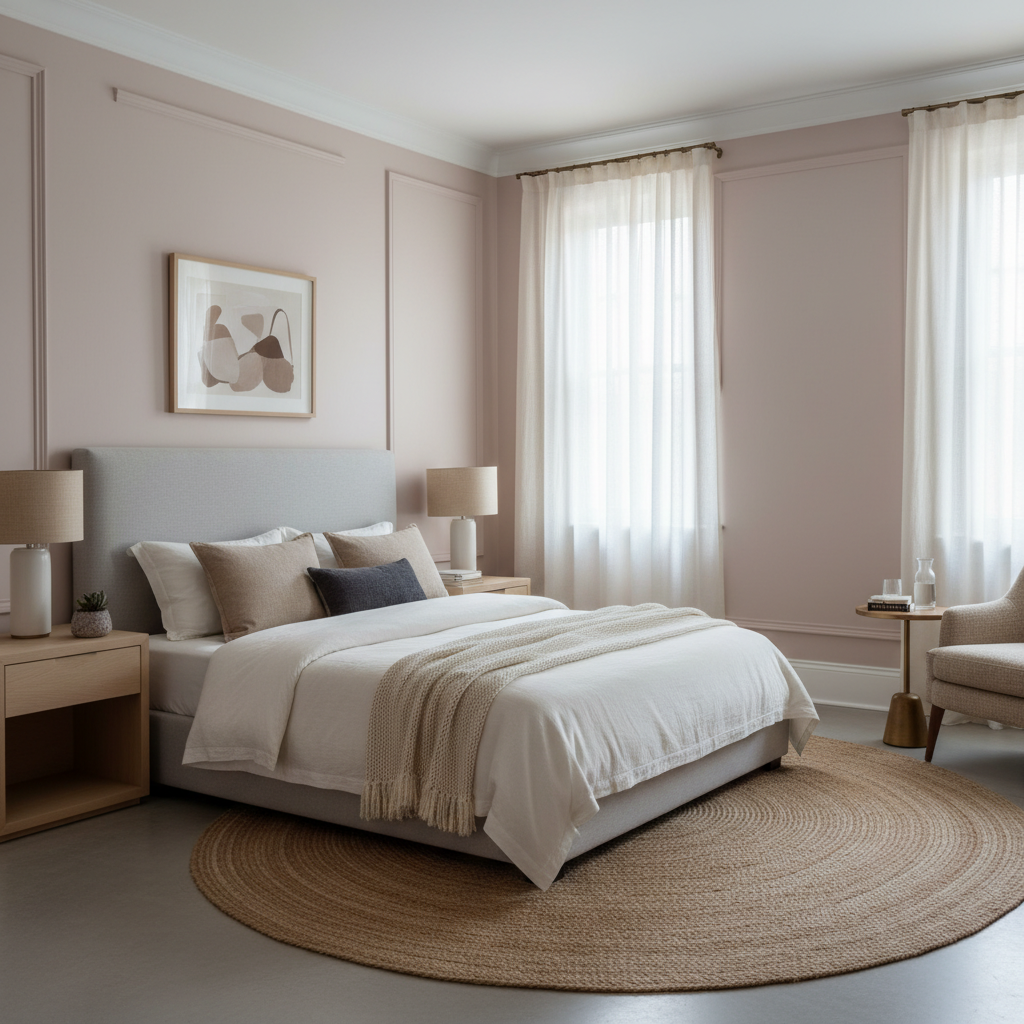
6. Blush Decor Ideas in the Bedroom: A Calming Romantic Retreat
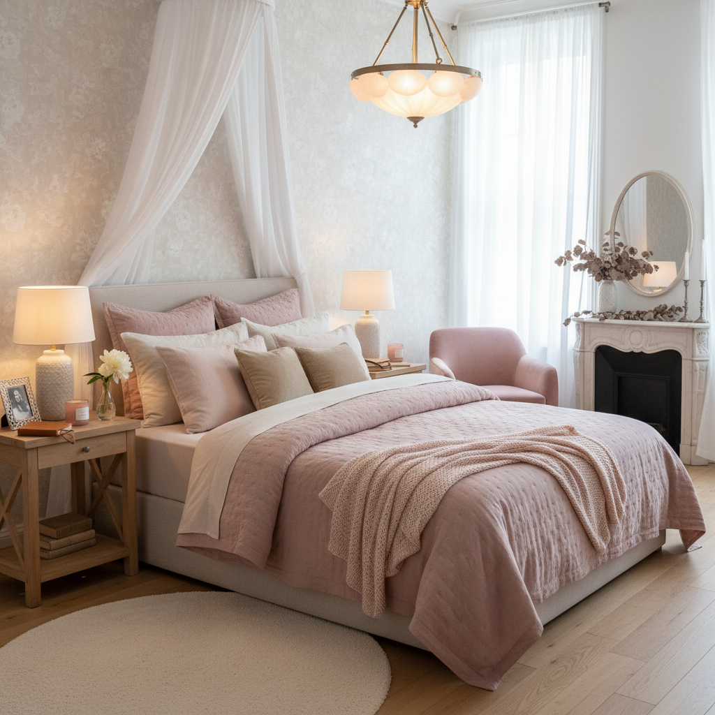
Bedrooms are where blush really works. The color psychology actually makes sense here – it’s calming without being cold, warm without being energizing.
Bedding is the obvious place to start. Parachute’s linen sheets in dusty rose are $200-300 for a set, but the quality justifies it. They get softer with washing and the color stays true. Brooklinen’s percale in blush runs about $150 for a sheet set.
If you’re not ready to invest in expensive sheets, start with pillowcases. You can test whether you like sleeping surrounded by the color. Target’s Threshold line usually includes blush in their seasonal collections, around $15-20 for a pillowcase set.
Layer different shades of blush and related colors. A dusty rose duvet with rose gold pillowcases and cream sheets. The variation keeps it from looking flat. All one shade of blush can feel overwhelming when you’re trying to sleep.
Curtains in blush linen soften morning light beautifully. They create this warm glow that makes waking up easier. Blackout lining helps if you need complete darkness, but the blush color still filters through during the day.
Keep the rest simple when you’re going for romantic bedroom design. White walls, natural wood furniture, maybe some brass accents. The bedroom should feel serene, not busy.
String lights add romance without being too precious. The warm light plays nicely with blush tones. Just don’t go overboard – a simple strand around the headboard or windows, not a full fairy light explosion.
Frequently Asked Questions About Blush Decor Ideas
Q: What colors go best with blush pink in home decor?
A: Cream, warm white, and soft gray are your safest bets. They let blush be the star without competing. Brass and gold metals add richness. Navy creates striking contrast if you want more drama. Sage green is surprisingly good together – both colors are muted and sophisticated.
Avoid pairing blush with cool grays or silver metals. The undertones clash and make everything look muddy. Hot pink is too much pink in one space. Pure white can make blush look dirty by comparison.
Q: Is blush pink still trendy in interior design?
A: Blush has staying power because it’s actually neutral enough to work long-term. Unlike millennial pink, which felt very of-the-moment, blush has this timeless quality that adapts to different styles.
That said, trends do shift. The Instagram-perfect blush and gold combination might feel dated in five years. But the color itself works in traditional, modern, and transitional spaces. It’s more versatile than most people expect.
Q: How do I prevent blush pink from looking too childish or feminine?
A: Balance is everything. Pair blush with materials that feel grown-up – brass, marble, dark wood, linen. Avoid ruffles, florals, and anything too precious.
Clean lines help too. A blush velvet sofa with modern legs reads sophisticated. The same fabric on a tufted Victorian-style chair might feel overly feminine. Geometric patterns work better than florals. Matte finishes feel more mature than glossy ones.