
Black rooms get a bad rap. People think they’re depressing or make spaces look smaller, but that’s mostly from seeing them done wrong. A properly executed black room design feels like stepping into a sophisticated hotel suite. Rich, dramatic, surprisingly cozy.
The difference comes down to understanding how black actually works in a space. It’s not just slapping Benjamin Moore’s Onyx on every wall and calling it a day. Black rooms need more thoughtful planning than beige ones, but the payoff is worth it. You get instant sophistication, a backdrop that makes everything else pop, and honestly, a room that photographs incredibly well if you’re into that.
Your lighting setup becomes crucial. Texture matters more than in any other color scheme. And you’ll need to think about contrast from the beginning, not as an afterthought. But once you nail these elements, black becomes this incredibly versatile foundation that works with almost anything you throw at it.
What are the Biggest Misconceptions About Black Room Design?
The “black makes rooms smaller” thing is only half true. Poorly lit black rooms feel smaller. Black rooms with good lighting can actually feel more expansive because the walls seem to recede into shadow, creating depth. I’ve seen 10×12 bedrooms painted in Sherwin Williams’ Tricorn Black that feel more spacious than white rooms of the same size.
Most people also think black means one flat color. Walk into any Benjamin Moore showroom and you’ll find at least twelve different blacks. Iron Ore leans gray and works well in rooms with limited natural light. Black Magic has brown undertones that feel warmer. Onyx is a true black that can handle bigger spaces with lots of windows. The wrong black in the wrong room is what gives black rooms their bad reputation.
Then there’s the texture misconception. People assume black paint is black paint, but the finish changes everything. Matte black absorbs light and creates this velvety, cocoon-like feeling. Satin black reflects just enough light to add subtle dimension. I’ve even seen high-gloss black used effectively in powder rooms, though that’s harder to pull off without looking like a nightclub bathroom.
The biggest myth though? That black rooms are depressing. People in well-designed dark spaces tend to report feeling more relaxed and focused than those in stark white environments. Your brain seems to process black rooms as intimate rather than oppressive, assuming the lighting works.
What actually makes black rooms feel heavy is when people go monochrome by accident. All black everything doesn’t work. You need contrast, texture, and strategic pops of other colors to keep things interesting. This approach to dark interior design creates spaces with proper visual balance.

How Can I Use Lighting to Transform a Black Room?
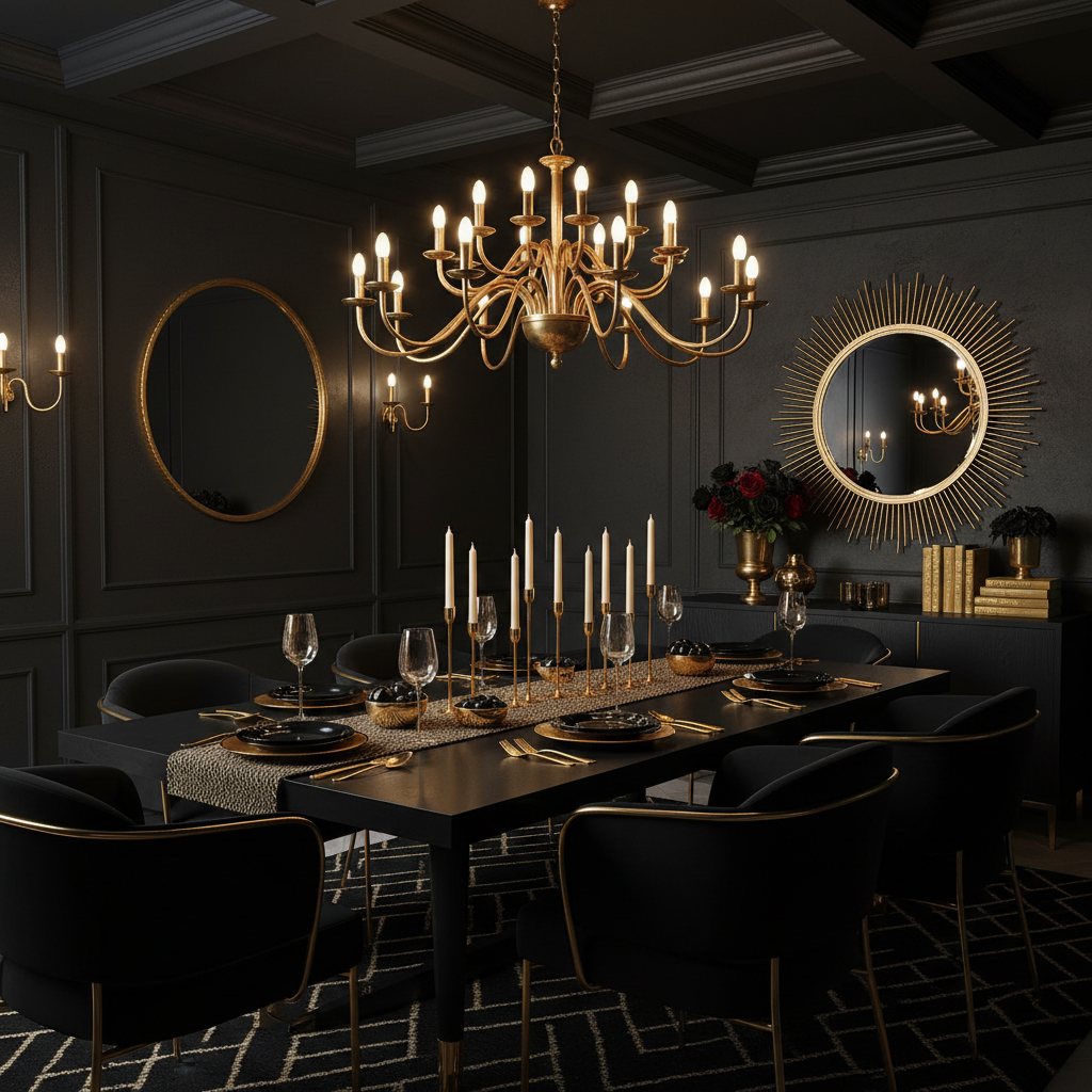
Forget about that single ceiling fixture you relied on in white rooms. Black walls eat light, so you need to approach lighting more like a film set than a typical living space. Layer everything. Multiple light sources at different heights create depth and prevent that cave feeling.
Start with ambient lighting but make it dimmable. Recessed lights work, though I prefer track lighting because you can adjust the direction. The Halo H7 series runs about $40 per fixture and gives you good control over beam spread. Add a dimmer switch, maybe another $25, and you can dial the mood from bright and energizing to low and cozy.
Task lighting becomes more important in black rooms because you lose the natural light reflection you get from pale walls. A good reading lamp next to your chair isn’t optional anymore. The CB2 John table lamp in brass runs around $150 and puts light exactly where you need it without overwhelming the space.
But accent lighting is where black rooms really shine. Picture lights, wall sconces, even LED strips behind floating shelves can create these pools of light that add drama. Artwork practically glows against black walls when properly lit. I’ve used simple battery-powered LED strips from Amazon, maybe $20 for a set of three, to highlight everything from floating bookshelves to architectural details.
Light bulb selection matters more than you’d think. Stick with warm white bulbs around 2700K. Cool white makes black rooms feel stark and institutional. And invest in quality bulbs. The cheap LED bulbs from the grocery store often have this greenish tint that looks terrible against black walls. Philips Warm Glow LEDs cost more upfront, around $8 per bulb, but they dim smoothly and maintain color temperature.
Position lights to graze the walls rather than hitting them straight on. This creates texture and prevents the flat, painted-backdrop look that kills the sophistication factor. Professional lighting design principles apply especially well to moody room aesthetics.
What Textures Work Best in a Black Room?
Texture saves black rooms from looking like empty voids. Without it, you get that flat, one-dimensional feeling that makes guests want to leave quickly. But layer in different materials and surfaces, and suddenly the space has depth and visual interest.
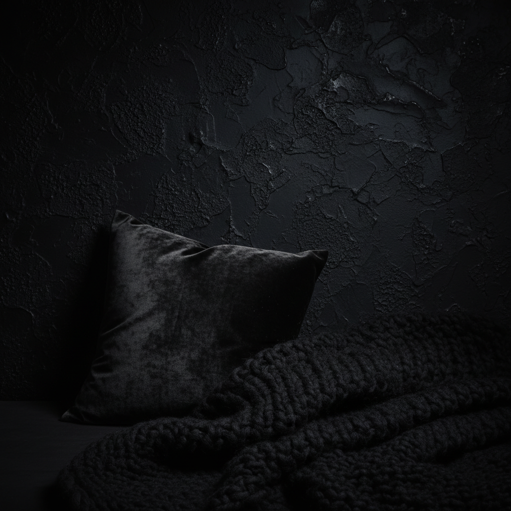
Velvet works incredibly well against black walls. The way it catches and reflects light creates subtle variations in the black itself. A West Elm velvet sectional in charcoal, around $1,200, gives you that luxury hotel feeling without going full gothic. Even smaller velvet pieces help. Throw pillows, ottomans, even velvet curtains add this richness that photographs beautifully.
Natural materials provide necessary contrast. A jute rug from World Market, maybe $200 for an 8×10, adds warmth and breaks up all that smooth paint. Live-edge wood shelves or a reclaimed wood coffee table introduce organic textures that prevent the space from feeling too designed.
Woven textures work well too. Linen curtains, chunky knit throws, even grasscloth wallpaper on an accent wall can add subtle texture without competing with the black. Target’s linen curtain panels run about $25 each and soften the hard edges that come with dark paint.
Metal accents provide textural contrast and light reflection. Brushed brass picture frames, a copper table lamp, even black iron hardware on cabinets creates visual layers. The goal is to have multiple textures within view from any seating position.
One thing to avoid: too many matte textures together. A matte black wall with matte black furniture and flat cotton upholstery creates this light-absorbing situation that feels oppressive. Mix matte and glossy, smooth and rough, natural and manufactured materials. This decorative styling approach prevents monochromatic spaces from feeling flat.
How Can I Use Color to Complement Black Room Design?
Black makes every other color look more saturated and intentional. Colors that seem bland against white walls suddenly pop against black. But you can’t just throw random colors around and hope it works. The key is choosing a limited palette and using it strategically.
White creates the most dramatic contrast and keeps things from feeling too heavy. White trim, white bedding, white lampshades all help balance the darkness. But pure white can feel stark. Try warm whites like Benjamin Moore’s Cloud White or even cream tones that feel softer against black walls.
Metallics add glamour without introducing actual color. Brass hardware, copper light fixtures, or silver picture frames catch light and create focal points. A brass floor lamp from CB2 runs around $200 and adds warmth that plain black and white lacks. Even small metallic accents help. Brass drawer pulls, maybe $8 each from Amazon, can elevate basic IKEA furniture.
Natural wood tones warm up black rooms significantly. A walnut dining table, white oak flooring, or even bamboo cutting boards displayed on open shelving introduce organic colors that feel grounding. The contrast between natural wood and painted black walls creates this modern cabin vibe that works in everything from bedrooms to kitchens.
For actual color pops, jewel tones work beautifully. Deep emerald green, rich navy blue, or burgundy red all complement black without looking juvenile. A single emerald velvet chair, maybe from Article for around $400, becomes a stunning focal point. Or try smaller doses through artwork, throw pillows, or a single statement vase.
Plants deserve special mention. The green looks incredible against black walls, and plants help soften the overall mood. A large fiddle leaf fig in a black planter creates this dramatic silhouette effect. Even smaller plants on shelves or side tables add life to what could otherwise feel like a moody cave. This home styling technique brings natural elements into sophisticated dark spaces.
Avoid pastels and bright primary colors. They tend to look cheap against black walls and create this juvenile contrast that undermines the sophistication you’re going for. Bold color combinations require careful room planning to achieve the right balance.