

Warm neutral tones get dismissed as boring, but that’s usually because people think of them as one flat beige. Actually, there’s a whole spectrum of colors that read as neutral but have enough warmth to make a room feel lived-in rather than sterile.
These aren’t the builder-grade beiges from 2005. We’re talking about colors with actual personality. Shades that work with your existing furniture instead of fighting it. Colors that look good at 7 AM and equally good when you’re hosting dinner at 8 PM.
Six colors that consistently work:
- Creamy Ivory: Brighter than white but not aggressive about it
Toasty Beige: The grown-up version of beige that doesn’t look bland - Greige Harmony: Gray plus beige, which sounds wrong but works
- Warm Taupe Embrace: Sophisticated brown without going full chocolate
- Honeyed Wheat: Golden without looking like a 1970s kitchen
- Terracotta Blush: Just enough pink to be interesting
Most of these work in any room! Some work better in specific spaces, which we’ll get into.
1. Creamy Ivory: A Timeless Classic

Creamy ivory is what happens when white gets just enough yellow undertones to feel warm. It’s brighter than most beiges but softer than pure white. Benjamin Moore’s Cloud White is probably the most popular version, though Sherwin Williams’ Creamy is slightly more yellow if that’s what your room needs.
The practical advantage is that it reflects light without feeling clinical. Good for smaller spaces or rooms that don’t get great natural light. North-facing rooms especially benefit from the warmth.
It pairs with almost everything, which sounds like generic design advice but is actually useful here. Navy blue looks sophisticated against creamy ivory. Forest green feels classic rather than overwhelming. Even coral, if that’s your thing, reads as intentional rather than loud.
Texture matters more with lighter colors. A flat paint finish can look chalky, but eggshell or satin gives you just enough sheen to keep it interesting. Matte works if you have good natural light, but test it first. Some rooms need that subtle reflectivity.
For furniture, creamy ivory works with both warm and cool wood tones. Walnut, maple, even that grayish driftwood finish that’s everywhere now. The color is forgiving enough that you don’t need to overthink coordinating undertones.
Pricing varies, but most major paint brands offer a decent creamy ivory for around $45-60 per gallon. Benjamin Moore costs more but covers better, so you might need fewer coats. Worth calculating the actual coverage rather than just the per-gallon price.
2. Best Warm Neutral Tones for Living Spaces: Toasty Beige Grounded Comfort

Toasty beige has enough brown undertones to feel substantial. It’s warmer than typical contractor beige but not so brown that it reads as a ‘color’ color, if that makes sense. Sherwin Williams’ Accessible Beige is the standard here, though Behr’s Perfect Taupe is similar for less money.
This works especially well in living rooms and bedrooms where you want that wrapped-in-a-blanket feeling. It’s cozy without being dark, which is harder to achieve than you’d think. This makes it one of the most popular paint colors for creating inviting home interiors.
The color pairs naturally with leather furniture. Brown leather, obviously, but also cognac and even black leather looks richer against toasty beige walls. Wood furniture in medium to dark tones works well. Lighter woods can look washed out unless you add enough contrast through textiles or accessories.
For accents, deeper colors work better than pastels. Navy, forest green, burgundy. Even black, though that might feel too heavy depending on your room size and light situation. Metallics like oil-rubbed bronze or aged brass complement the warmth without competing.
Fabric choices matter. Linen in natural tones, wool throws in cream or oatmeal, even denim blue if you’re going for a casual feel. The base color is warm enough that cooler accent fabrics don’t clash.
One consideration is that toasty beige can feel dated if you’re not careful with the styling. It was popular in the early 2000s, so avoid pairing it with things that scream that era. Skip the burgundy and gold color scheme. Go easy on the tuscan-style accessories.
3. Greige Harmony: The Best of Both Worlds
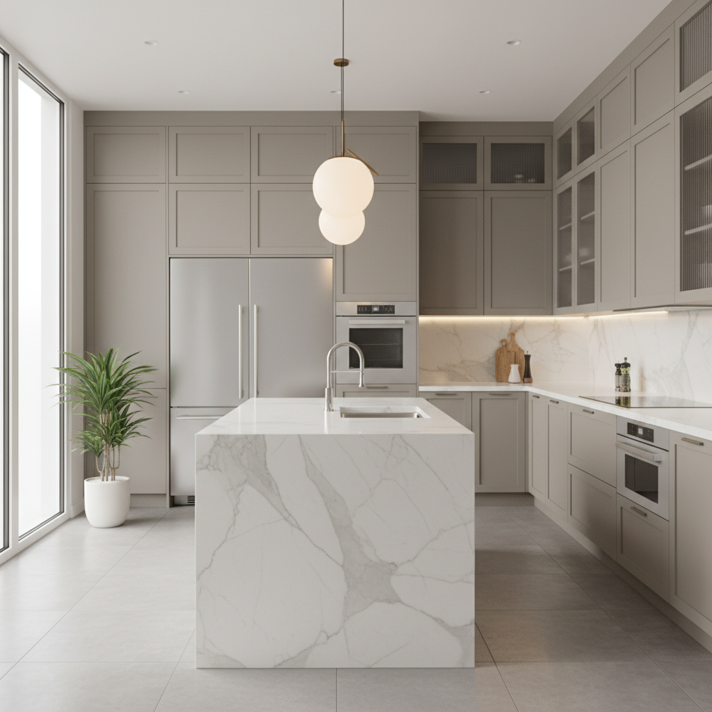
‘Greige’ sounds like it could be the name of one of Kim Kardashian’s kids, but it’s basically the color beige with gray undertones instead of yellow ones. Less warm than straight beige, but not as cool as gray. Sherwin Williams’ Agreeable Gray is the most popular version. Benjamin Moore’s Revere Pewter is slightly more beige.
The advantage is versatility. Greige works with both warm and cool color schemes, which is useful if you’re not sure what direction you want to go or if you have existing furniture in mixed undertones. This flexibility makes it perfect for modern home design trends.
In kitchens, greige cabinets look current without being trendy. They work with white subway tile, but also with warmer materials like butcher block counters or brass hardware. More flexible than pure gray, which can look cold, or beige, which might feel too traditional for a modern kitchen.
For living spaces, greige provides a sophisticated backdrop that doesn’t compete with artwork or furniture. It’s neutral enough for bold accent colors but has enough character that it doesn’t disappear entirely. When choosing paint colors for open floor plans, greige creates seamless flow between rooms.
The trick with greige is getting the balance right. Too much gray and the room feels cold. Too much beige and you’ve basically got regular beige with a trendy name. Test samples in your actual lighting, because greige can shift depending on whether you have warm or cool light sources.
Natural light affects greige more than some other neutrals. North light brings out the gray undertones. South light emphasizes the beige. This isn’t necessarily a problem, but it’s worth knowing what you’re getting.
Works well with both silver and gold metallics, which is unusual. Most colors favor one or the other, but greige splits the difference enough to accommodate either.
4. Warm Taupe Embrace: Refined Earthiness

Warm taupe sits between beige and brown, with enough sophistication to work in formal spaces but enough warmth for everyday rooms. Benjamin Moore’s Rockport Gray is actually more taupe than gray despite the name. Sherwin Williams’ Balanced Beige is another good option.
This color works particularly well in home offices or studies. It’s serious enough for work but not so stark that it feels institutional. The warmth keeps it from being austere. For professionals working from home, neutral wall colors like taupe create the perfect backdrop for video calls.
Taupe pairs beautifully with cream and ivory, creating a monochromatic scheme that’s sophisticated without being boring. Add texture through fabrics, wood grains, or even wallpaper in one section of the room.
For accent colors, jewel tones work well. Deep emerald, sapphire blue, even amethyst purple. The earthiness of taupe grounds these richer colors so they don’t overwhelm the space. Metallics in brass or copper complement the warmth.
Natural materials look especially good with warm taupe. Raw wood, stone, jute rugs, linen fabrics. There’s something about the color that enhances organic textures rather than competing with them. This creates that coveted earthy color palette that feels both grounded and elegant.
One thing about taupe is that cheap paint versions can look muddy. This is a color where quality matters. Better pigments give you that smooth, sophisticated look instead of something that reads as dingy.
Lighting considerations are important. Warm taupe can look flat under cool LED bulbs. Warmer light sources, whether incandescent or warm LED, bring out the richness of the color.
5. Honeyed Wheat: Sun-Kissed Warmth

Honeyed wheat has golden undertones that make it feel sunny even when it’s cloudy outside. It’s warmer than most beiges but not so yellow that it feels aggressive. Benjamin Moore’s Hawthorne Yellow is close, though it’s technically classified as a yellow. Sherwin Williams’ Believable Buff is more solidly in neutral territory.
This works especially well in dining rooms and kitchens. There’s something about the warmth that feels appropriate for spaces where people gather around food. It’s welcoming without being overpowering.
The golden undertones complement wood furniture beautifully, particularly medium to dark woods like cherry or walnut. Even oak looks good, which isn’t always a given with neutral wall colors. This natural harmony makes it easier to coordinate furniture pieces when decorating your dining room on a budget.
For textiles, deeper colors create nice contrast. Navy blue, forest green, even burgundy. White and cream work too, though you’ll want to add some darker elements to prevent the whole room from feeling too light.
Natural light affects this color more than some others. Rooms with southern exposure might find it too warm, while northern rooms often benefit from the golden undertones. Test it in your specific space before committing.
One consideration is that honeyed wheat can feel dated if styled wrong. It was popular in country-style decorating, so avoid pairing it with too many roosters or gingham patterns. Keep the styling clean and current.
Works well with brass and copper metallics. Silver can look cold against the warmth, though it’s not impossible to make work with the right balance.
6. Terracotta Blush: Subtle Personality

Terracotta blush is barely pink, but that slight undertone makes it more interesting than straight beige. It’s warm without being overwhelming, which makes it good for smaller spaces like bathrooms or powder rooms where you want some personality but can’t handle a bold color.
Clare’s Current Mood is probably the most popular version, though it’s a direct-to-consumer brand so you’ll need to order online. Sherwin Williams’ Cavern Clay is similar and won the Color of the Year award in 2019, so it’s widely available.
This color works particularly well with white trim and fixtures. The contrast is subtle but enough to define architectural details. In bathrooms, white subway tile or marble looks sophisticated against terracotta blush walls. This creates that spa-like bathroom design that feels both relaxing and stylish.
For larger spaces, use it as an accent wall rather than painting the entire room. It has enough character that a little goes a long way. Behind a bed, in a dining room, or on a fireplace wall.
Metallics matter with this color. Brass and copper look natural. Gold can work but might be too much warmth. Silver and chrome create nice contrast, though the effect is more contemporary than cozy.
Natural materials complement the earthiness. Wood vanities, stone counters, jute rugs. There’s something organic about the color that pairs well with natural textures. This makes it perfect for creating a cozy bedroom retreat with minimal effort.
The pink undertones mean this color can shift depending on lighting. Warm light emphasizes the terracotta side. Cool light brings out the pink, which might not be what you want in every room.
Frequently Asked Questions
Q: What are the benefits of using warm neutral tones in my home?
A: Warm neutrals are forgiving. They work with different furniture styles and wood tones, which matters if you’re not starting from scratch. They also tend to make rooms feel larger and brighter than darker colors, but with more personality than stark white. Plus they photograph well, which is useful for resale value.
Q: How do I choose the right warm neutral tone for my space?
A: Look at your existing furniture and flooring first. If you have cool-toned woods or predominantly gray furniture, greige might work better than golden beige. Consider your lighting too. North-facing rooms often benefit from warmer undertones, while south-facing rooms can handle cooler neutrals.
Q: Can I mix different warm neutral tones in the same room?
A: Yes. Though it takes some planning. Use different shades for different elements rather than different walls. Maybe greige walls with toasty beige furniture and creamy ivory trim. The key is varying the intensity rather than the undertones, if that makes sense. Test combinations before committing to the whole room.