

Olive green has this weird ability to make a room feel both grounded and sophisticated. Not the army green that screams military surplus store, but that muted, earthy tone that feels like you’re wrapped in nature’s quieter moments.
There’s something about olive green that just works. Maybe it’s because our brains associate it with living things without the aggressive brightness of lime or the heaviness of forest green. It sits somewhere in between, which is probably why it photographs so well on Instagram and actually feels livable in real life.
We’re looking at five different olive green rooms that go beyond just painting a wall and calling it done. These spaces show how the color changes depending on what you pair it with and how much natural light you’re working with.
- Olive Green Bedroom Oasis: How this color creates the kind of bedroom where you actually want to spend time, not just crash.
- Olive Green Living Room Retreat: Making your main gathering space feel warm without looking like a 1970s rec room.
- Olive Green Kitchen Serenity: Cabinetry that feels fresh but won’t look dated in three years.
- Olive Green Bathroom Haven: Turning your bathroom into something that feels more spa, less sterile.
- Olive Green Office Sanctuary: A workspace that doesn’t make you want to immediately check your phone.
1. Olive Green Bedroom Oasis: Sleep Soundly in Nature's Embrace
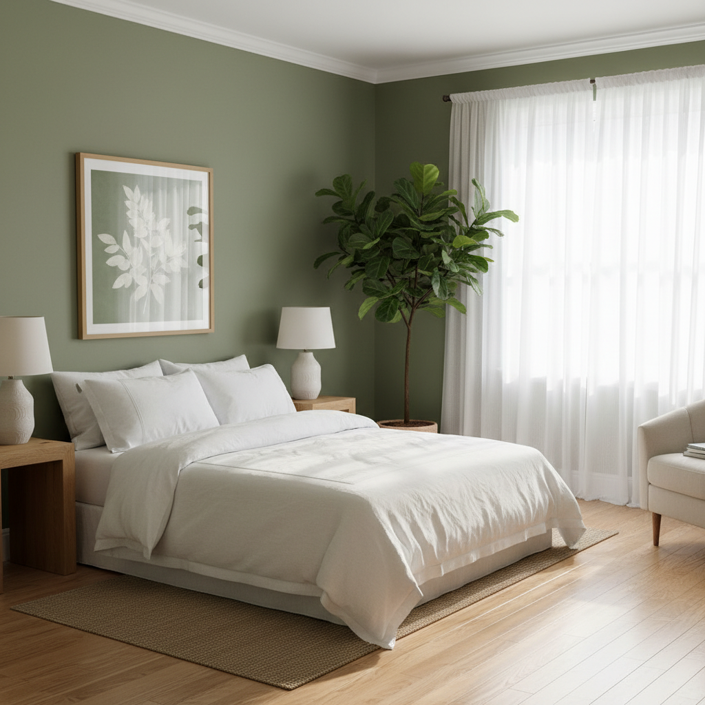
Your bedroom should feel like a retreat, not like you’re sleeping in a box store display. Olive green walls actually help with this more than you’d expect, especially if you pick the right shade for creating a restful bedroom atmosphere.
The trick is going lighter than you think you want. Benjamin Moore’s Weimaraner or Sherwin Williams’ Artichoke both hit that sweet spot where the color feels substantial without making your room feel like a cave. If your bedroom gets decent morning light, you can go slightly deeper. North-facing room? Stick with the lighter options.
White or cream bedding is pretty much mandatory here. The contrast makes both colors look better, and honestly, white sheets just feel cleaner. West Elm’s Belgian Flax linen sheets run around $200 for a queen set, but Target’s Casaluna linen blend gets you most of the look for about $60. Either way, that rumpled linen texture against olive walls creates exactly the relaxed vibe you’re after.
For furniture, wood tones work better than painted pieces. A simple oak nightstand from IKEA (their Hemnes line, maybe $80 each) adds warmth without competing with the wall color. Skip the matching bedroom set approach. Mix a walnut dresser with lighter wood nightstands. The slight variation feels more collected, less catalog.
Plants obviously belong here, but don’t go overboard. A snake plant in a simple ceramic pot does the job without turning your bedroom into a greenhouse. The Home Depot usually has decent-sized ones for under $25, and they’re basically impossible to kill.
Lighting matters more than you think. Those overhead ceiling fans with built-in lights wash everything out and make olive green look muddy. Table lamps with warm LED bulbs (around 2700K) make the color feel richer. IKEA’s Fado table lamps are like $25 and cast a nice, diffused light that doesn’t harsh up the whole vibe.
Blackout curtains in cream or soft white keep the color palette simple and actually help you sleep better. The key is layering them over sheer panels so you’re not living in complete darkness during the day. It’s a small thing, but it makes the room feel more finished.
2. Olive Green Living Room Retreat: A Warm and Inviting Social Hub

Living rooms are tricky because they need to work for Netflix marathons and dinner parties. Olive green as an accent wall tends to work better than painting the whole room, especially if you’re renting and want to keep things reversible.
Pick the wall behind your sofa or your TV. It creates a focal point without boxing you in color-wise. The other walls can stay white or a very light gray, which keeps the space feeling open while giving that olive green room to breathe.
A gray sofa makes the most sense here. Not the builder-grade beige that every apartment complex uses, but a proper charcoal or light gray. Article’s Sven sofa runs around $1200 for a three-seater, but Wayfair’s house brand often has similar styles for closer to $600. The clean lines work with the olive without looking too matchy.
Coffee tables in walnut or oak add warmth and tie back to the natural feeling olive green creates. Something simple works better than ornate. CB2 has some solid options around $300, or you can find vintage Danish modern pieces on Facebook Marketplace that look way more expensive than they are.
Throw pillows are where you can play around with furniture arrangement and textile choices. Burnt orange, mustard, even a muted pink all work with olive green. Mix textures like linen, velvet, and woven fabrics. Target’s Threshold brand has decent options for under $20 each, and you can swap them out seasonally without breaking the budget.
The rug needs to be big enough that at least the front legs of your furniture sit on it. 8×10 minimum for most living rooms. Jute or wool in neutral tones ground the space without competing with the wall color. Rugs USA frequently has sales where you can get something decent for under $200.
Lighting layering makes any room feel more expensive. A floor lamp in one corner, table lamps on side tables, maybe a pendant light if you have high ceilings. Warm bulbs only. The harsh white LED situation makes olive green look sickly.
Plants help, but don’t go full jungle. A fiddle leaf fig in the corner (if you can keep it alive), maybe a pothos trailing from a bookshelf. The goal is to enhance the natural feeling, not create an indoor forest.
3. Olive Green Kitchen Serenity: Culinary Calm

Olive green kitchen cabinets sound risky until you see them done right. They’re definitely having a moment, which means you can actually find them at places like Home Depot and Lowe’s now instead of having to custom order everything.
The upper and lower cabinet situation needs thought. All olive can feel heavy, especially in kitchens without tons of natural light. Consider olive lowers with white or cream uppers. It grounds the space without making it feel cave-like. Or flip it: white lowers, olive uppers, which can make ceilings feel higher.
IKEA’s cabinet boxes work fine, but you’ll want to upgrade the fronts if you’re going olive green. Semihandmade makes custom fronts that fit IKEA boxes, running maybe $150-200 per door compared to $300+ for completely custom cabinets. Their DIY approach means the color options are actually pretty good.
White quartz countertops keep things from getting too earthy. Caesarstone and Silestone both make versions that look like Carrara marble but won’t stain when you spill red wine. Expect around $70-90 per square foot installed, which isn’t cheap but holds up better than actual marble in a kitchen.
Hardware matters more than you think for the overall kitchen design aesthetic. Brass or brushed gold cabinet pulls warm up olive green nicely. Black hardware works too but feels more modern farmhouse, which might be what you want. CB2 and West Elm both carry decent options around $8-15 per pull.
The backsplash should probably stay neutral. White subway tile is classic for a reason, or consider natural stone if your budget allows. Avoid anything too busy or colorful since the olive cabinets are already doing the heavy lifting visually.
Pendant lights over an island can tie the whole look together. Something in brass or black iron, depending on your hardware choice. The scale matters: too small and they look lost, too big and they overwhelm the space.
Open shelving breaks up solid runs of cabinets and gives you a place to display the pretty dishes. Just be honest about whether you’ll keep them organized. Instagram-worthy open shelving requires actual maintenance.
4. Olive Green Bathroom Haven: Spa-Like Relaxation at Home
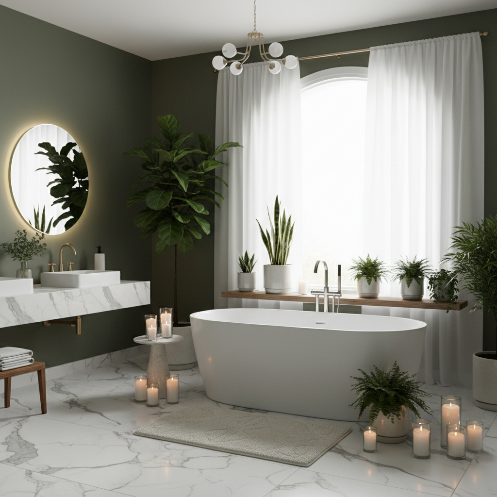
Bathrooms are actually perfect for olive green because the color feels naturally clean and spa-like. Plus, most bathrooms are small enough that you can be bold without committing to painting your entire house.
In a small bathroom, olive green works better as an accent wall or in a powder room where you’re not spending extended time. Larger master bathrooms can handle olive on most walls, especially if you balance it with white trim and plenty of good lighting.
The key is choosing the right finish. Semi-gloss or satin paint handles bathroom humidity better than flat paint, and it’s easier to clean. Benjamin Moore’s Advance paint is worth the extra cost in bathrooms because it dries to an almost lacquer-like finish that really holds up.
White fixtures are your friend here. Olive green with white subway tile creates a classic combination that won’t look dated in five years. If you want to get fancy, consider natural stone like travertine or marble, but honestly, good ceramic tile often looks just as expensive for way less money.
Lighting in olive green rooms needs to be warm and layered. Those builder-grade vanity strips with bare bulbs make any color look harsh. Wall sconces on either side of the mirror provide better, more flattering light for creating a relaxing bathroom environment. Look for fixtures in brass or matte black to complement the olive.
Plants (some, not all) thrive in bathroom humidity, and they make olive green feel more intentional. A snake plant in the corner, maybe some pothos on a shelf. Even fake plants work if you find realistic-looking ones. The visual softness is what matters.
Towels and bath mats can pick up the color story. Cream, white, or even a soft pink all work beautifully against olive walls. Turkish cotton towels from places like Parachute run around $30-40 each, but Target’s Casaluna line gets you similar quality for about half the price.
A wooden stool or small side table adds warmth and gives you a place for candles or bath products. Teak works especially well in bathrooms because it handles moisture better than other woods.
5. Tranquil Olive Green for Your Home Office
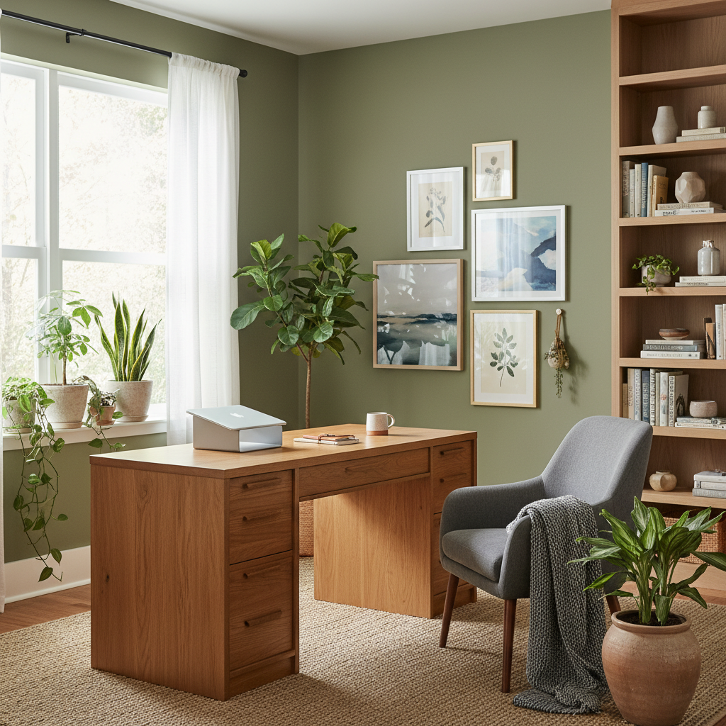
Working from home means your office needs to feel energizing but not overstimulating. Olive green hits that balance better than you might expect, especially if your work involves a lot of screen time and you’re designing a productive home workspace.
The shade matters here more than in other rooms. Too light and it feels wishy-washy, too dark and it becomes depressing by 3 PM. Something in the middle range works best. Sherwin Williams’ Secret Garden is a good starting point, rich enough to feel substantial but not so deep it sucks up all the light.
Natural light makes or breaks an olive green office. If your space gets decent daylight, you’re golden. North-facing or basement offices might struggle unless you invest in really good artificial lighting. Full-spectrum LED bulbs help, but they’re not magic.
A wooden desk grounds the space and feels more substantial than those white IKEA tables everyone defaults to. You don’t need to spend thousands. Facebook Marketplace and estate sales often have solid wood pieces that just need some love. A good sanding and Danish oil finish can make a $50 find look like a $500 piece.
Your chair deserves more thought than most people give it. If you’re spending real hours here, something ergonomic matters for your back and your productivity. The Herman Miller Aeron is the gold standard but runs over $1000. Steelcase and Hon make decent alternatives for closer to $300-400.
Storage keeps olive green offices from feeling cluttered, which is important because the color shows mess more than white walls do. Simple wooden shelves or a credenza in matching wood tones maintain the calm vibe while keeping papers and supplies organized for an efficient home office setup.
Plants make any office feel less corporate, and they actually do improve air quality measurably. A large plant in the corner, maybe a few smaller ones on shelves. Snake plants, pothos, and ZZ plants all tolerate the lower light levels most home offices have.
Artwork and personal touches prevent the space from feeling too serious. A few pieces you actually like, not just random prints to fill wall space. The goal is creating a place where you want to spend time, not just a beige box where work happens.
Frequently Asked Questions
Q: What colors complement olive green in a room?
A: White and cream are the safe bets that work in any room. They make olive green look cleaner and more intentional rather than muddy. For something with more personality, burnt orange and mustard yellow create a retro-inspired palette that feels warm without being overwhelming.
Blush pink might sound weird, but it actually works beautifully with olive green, especially in bedrooms or living rooms where you want something softer. Brass and gold accents add richness, while matte black creates a more modern, graphic feel. Navy blue works too, though the combination can feel heavy if you don’t balance it with enough white or natural light.
Q: Is olive green a good color for a small room?
A: It depends on the shade and how much natural light you’re working with. Lighter olive greens can actually make small rooms feel larger because they reflect more light than darker colors. But those deep, moody olive greens that look amazing on Instagram can make a small room feel cramped.
If you love a darker olive but have a small space, try it on just one accent wall rather than the whole room. Or use it in a powder room where the small size feels cozy rather than claustrophobic. Adding mirrors and keeping furniture light-colored helps balance darker wall colors in tight spaces.
Q: How can I make an olive green room feel more inviting?
A: Texture is everything. Smooth olive green walls can feel flat and institutional, but add a chunky knit throw, some linen pillows, and a jute rug, and suddenly the same color feels cozy and lived-in.
Warm lighting makes a huge difference too for creating cozy room ambiance. Those harsh LED bulbs make olive green look sickly, but warm-toned bulbs (look for 2700K on the package) bring out the richness in the color. Table lamps and floor lamps create pools of light that feel more intimate than overhead fixtures. Plants help bridge the gap between the natural color and actual nature, making the space feel more organic and welcoming.