

Want to infuse your home with happiness? The colors surrounding you can significantly impact your mood. Selecting the right hues for your walls and décor is a powerful way to cultivate a positive and joyful atmosphere. Let’s explore seven mood-boosting shades that can transform your house into a happy home.
- Sunshine Yellow: Evokes feelings of optimism, energy, and cheerfulness, perfect for brightening up kitchens and living areas.
- Tranquil Blue: Promotes relaxation, serenity, and a sense of calm, ideal for bedrooms and bathrooms.
- Earthy Green: Connects you to nature, fostering feelings of balance, growth, and well-being, great for any room.
- Optimistic Orange: Encourages enthusiasm, creativity, and sociability, making it suitable for dining rooms and home offices.
- Playful Pink: Creates a sense of comfort, love, and playfulness, working well in bedrooms or creative spaces.
- Warm Beige: Provides a neutral, grounding backdrop that promotes relaxation and allows other colors to pop. A versatile choice for almost any room.
- Invigorating Turquoise: Combines the calming aspects of blue with the revitalizing energy of green, offering a refreshing and uplifting vibe, excellent for bathrooms and home offices.e
1. Sunshine Yellow: Embrace the Power of Optimism
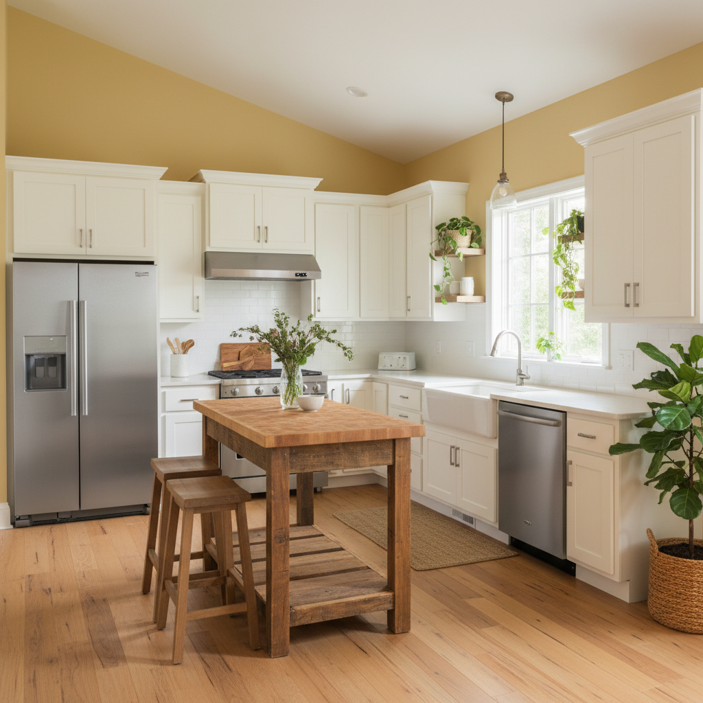
Yellow is the color of sunshine, happiness, and optimism. It’s a powerful mood booster that can instantly uplift your spirits. Studies have shown that yellow can stimulate creativity and increase energy levels. Using yellow in your home, particularly in rooms where you spend a lot of time during the day, can help create a more positive and energetic atmosphere. A survey by the National Kitchen and Bath Association found that yellow is increasingly popular in kitchen designs.
Consider painting your kitchen walls a soft, buttery yellow to create a warm and inviting space. Alternatively, use yellow as an accent color in your living room by adding yellow throw pillows, artwork, or decorative accessories. For a more subtle approach, incorporate yellow flowers or plants into your décor. A small pop of yellow can go a long way in brightening up a room. However, it’s essential to use yellow in moderation. Too much yellow can be overwhelming and even cause feelings of anxiety. Opt for softer shades of yellow and balance them with neutral colors like white, gray, or beige. You can also combine it with darker shades of wood for a beautiful contrast. The key is to find the right balance that works for you and your personal style. Experiment with different shades and combinations to find the perfect happy medium.
2. Tranquil Blue: Create a Haven of Serenity

Blue is universally recognized as a calming and soothing color. It’s associated with the sky and the ocean, both of which evoke feelings of peace and tranquility. Incorporating blue into your home, especially in bedrooms and bathrooms, can help create a relaxing and restful environment. Research suggests that blue can lower heart rate and blood pressure, promoting a sense of calmness.
Choose a soft, light blue for your bedroom walls to create a serene and restful atmosphere. Pair it with white linens and natural textures like wood or linen to enhance the calming effect. In the bathroom, consider using blue tiles or paint to create a spa-like oasis. Accent with natural elements like plants and candles to further enhance the relaxing ambiance. Different shades of blue evoke different feelings. Lighter shades of blue are more calming and serene, while darker shades can be more dramatic and sophisticated. Navy blue, for example, can add a touch of elegance to a room, while still maintaining a sense of calmness. When choosing blue, consider the size of the room and the amount of natural light it receives. Lighter shades are best for smaller rooms or rooms with limited natural light, while darker shades can work well in larger, brighter spaces. You may want to also consider the undertones of the blue. Some blues have warm undertones, while others have cool undertones.
3. Earthy Green: Connect with Nature's Healing Power

Green is the color of nature, growth, and renewal. It’s a grounding color that can bring a sense of balance and harmony to your home. Studies have shown that green can reduce stress and anxiety, promoting feelings of well-being. Bringing the outdoors in with earthy green tones can create a calming and revitalizing atmosphere in any room. A study published in the Journal of Environmental Psychology found that exposure to green environments can improve mood and cognitive function.
Paint your living room walls a soft, earthy green to create a calming and inviting space. Incorporate natural elements like plants, wood furniture, and stone accents to enhance the connection to nature. In the bedroom, consider using green bedding or curtains to create a restful and rejuvenating environment. Green also works well in home offices, as it can promote focus and concentration. Different shades of green can evoke different feelings. Lighter shades of green are more refreshing and invigorating, while darker shades are more grounding and calming. Forest green, for example, can create a sense of tranquility and sophistication, while lime green can add a pop of energy and vibrancy. When choosing green, consider the overall style of your home and the feeling you want to create. Green is also a great color to use in combination with other colors. It pairs well with neutral colors like white, gray, and beige, as well as with bolder colors like yellow, orange, and blue.
4. Optimistic Orange: Ignite Enthusiasm and Creativity

Orange is a vibrant and energetic color that is associated with enthusiasm, creativity, and sociability. It’s a warm and inviting color that can add a touch of playfulness to your home. Incorporating orange into your décor can help create a stimulating and uplifting atmosphere. Studies show that orange can stimulate appetite and encourage conversation, making it an excellent choice for dining rooms and social spaces.
Consider painting your dining room walls a warm, inviting shade of orange to create a space where people feel comfortable and energized. Add colorful artwork and playful décor (both from Amazon) to enhance the energetic atmosphere. In a home office, use orange as an accent color to stimulate creativity and productivity. Orange can also be used effectively in living rooms and family rooms to create a warm and inviting space. It’s important to use orange in moderation, as too much orange can be overwhelming and even cause feelings of anxiety. Balance orange with neutral colors like white, gray, or beige to create a harmonious and balanced space. Different shades of orange evoke different feelings. Lighter shades of orange are more playful and energetic, while darker shades are more sophisticated and grounding. Terracotta, for example, can create a sense of warmth and earthiness, while tangerine can add a pop of energy and vibrancy. When choosing orange, consider the overall style of your home and the feeling you want to create.
5. Playful Pink: Embrace Comfort and Love
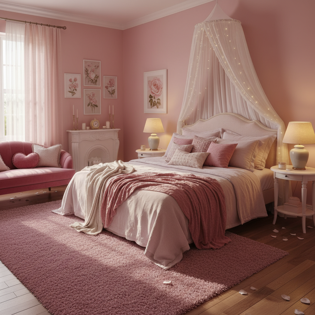
Pink is often associated with love, compassion, and playfulness. It’s a comforting color that can create a sense of warmth and security in your home. Incorporating pink into your décor can help create a relaxing and inviting atmosphere. Some studies suggest that pink can have a calming effect on the nervous system, promoting feelings of well-being. Clearly, we love pink (when properly utilized) and have a full how-to guide on adding it to your décor.
Consider using a soft, blush pink for your bedroom walls to create a romantic and comforting space. Add soft bedding, plush rugs, and romantic décor to enhance the sense of comfort and love. In a child’s bedroom or playroom, use brighter shades of pink to create a playful and energetic atmosphere. Pink can also be used effectively in living rooms and bathrooms to create a warm and inviting space. Different shades of pink evoke different feelings. Lighter shades of pink are more delicate and romantic, while darker shades are more sophisticated and grounding. Hot pink, for example, can add a pop of energy and vibrancy, while rose pink can create a sense of warmth and elegance. When choosing pink, consider the overall style of your home and the feeling you want to create. Balance pink with neutral colors like white, gray, or beige to create a harmonious and balanced space. It also goes well with gold accents to add a touch of luxury.
6. Warm Beige: The Grounding Power of Neutrality
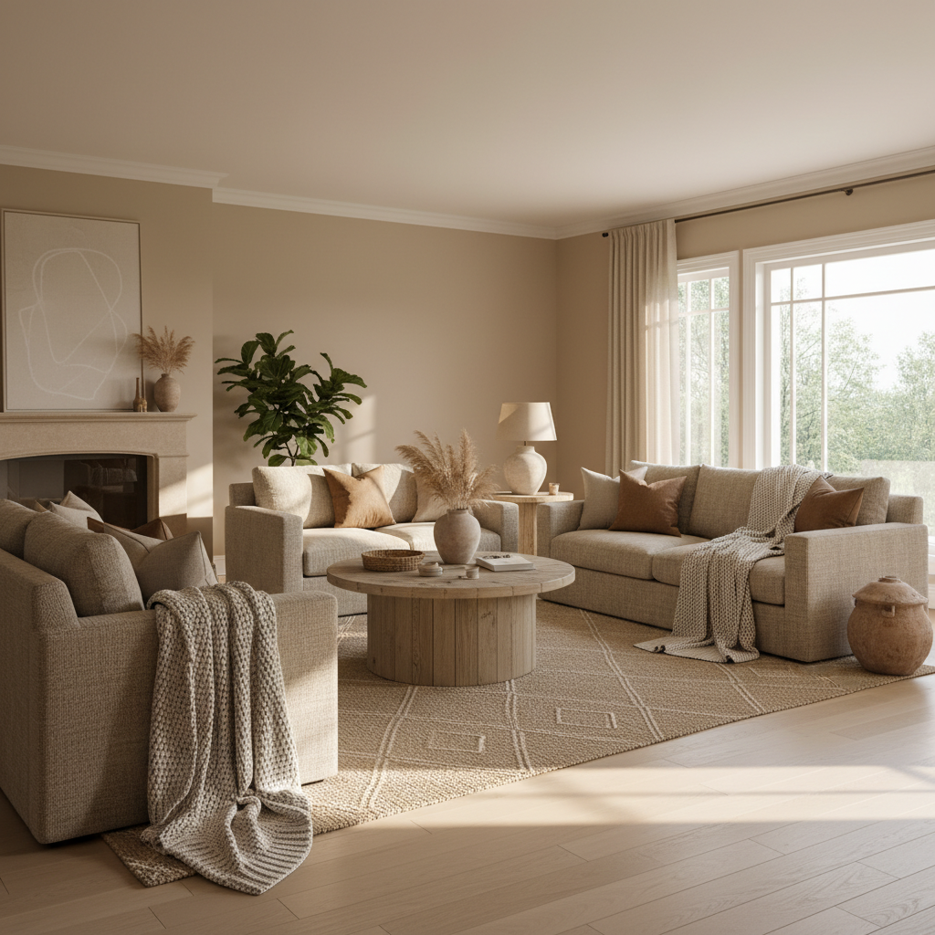
Beige, often underestimated, is a versatile and grounding neutral color. It provides a calming and comforting backdrop that allows other colors to shine. It promotes relaxation and a sense of stability in your home. Using beige as a base color allows you to easily incorporate pops of color through furniture, accessories, and artwork. Beige is a timeless choice that works well in a variety of design styles, from traditional to modern.
Consider using a warm beige for your living room walls to create a neutral and inviting space. Add pops of color through your furniture, artwork, and accessories to create a personalized and vibrant atmosphere. In the bedroom, use beige as a grounding color to promote relaxation and rest. Beige also works well in bathrooms, kitchens, and hallways, providing a cohesive and calming feel throughout your home. When choosing beige, consider the undertones. Some beiges have warm undertones, while others have cool undertones. Warm beiges tend to have hints of yellow or orange, while cool beiges have hints of gray or blue. Choose a beige that complements the other colors in your home and creates the desired mood. Beige can also be combined with other neutral colors like white, gray, and brown to create a sophisticated and timeless look.
7. Invigorating Turquoise: A Refreshing Blend of Calm and Energy

Turquoise, a captivating blend of blue and green, offers a unique combination of calming and invigorating qualities. It’s a refreshing color that can uplift your spirits and create a sense of tranquility in your home. Turquoise is associated with the ocean, the sky, and tropical landscapes, evoking feelings of peace, serenity, and vitality. Incorporating turquoise into your décor can help create a space that is both relaxing and energizing.
Consider using turquoise tiles in your bathroom to create a spa-like oasis. Pair it with white fixtures and natural wood accents to enhance the refreshing and clean feel. In a home office, use turquoise as an accent color to promote focus and creativity. Turquoise can also be used effectively in living rooms and bedrooms to create a calming and inviting space. Different shades of turquoise evoke different feelings. Lighter shades of turquoise are more airy and refreshing, while darker shades are more sophisticated and grounding. Teal, for example, can create a sense of drama and elegance, while aqua can add a pop of energy and vibrancy. When choosing turquoise, consider the overall style of your home and the feeling you want to create. It is also a great choice to use in combination with other colors. It pairs well with neutral colors like white, gray, and beige, as well as with bolder colors like yellow, orange, and pink.
Feel like your rooms are giving off the right vibes in terms of color, but you’re running out of places to store items. Check out our article on creative storage ideas for tips on keeping things out of sight, without them falling out of mind.
Frequently Asked Questions
Q: How do I choose the right mood-boosting shades for my home?
A: Consider the function of each room and the mood you want to create. Bedrooms benefit from calming colors like blue or green, while living rooms might benefit from more social colors like yellow or orange. Experiment with paint samples and observe how the colors look in different lighting conditions. Also, think about your personal preferences and what colors make you feel good. Don’t be afraid to try something new, but also consider what you already love. It’s important to create a space that reflects your personality and makes you feel comfortable and happy.
Q: Can I combine multiple mood-boosting shades in one room?
A: Absolutely! Combining colors can create a more dynamic and personalized space. However, it’s important to balance the colors to avoid overwhelming the room. Use the color wheel to find complementary colors or choose different shades of the same color for a more cohesive look. A good rule of thumb is to choose one dominant color and use the other colors as accents. You can also use neutral colors like white, gray, or beige to create a harmonious backdrop for your mood-boosting shades.
Q: Are there any colors I should avoid when trying to create a happy home?
A: While personal preferences vary, some colors are generally associated with negative emotions. Dark, somber colors like gray or dark brown can sometimes create a gloomy or depressing atmosphere. However, these colors can be used effectively as accents or in combination with brighter colors to create a more balanced space. The key is to use colors that make you feel good and create a positive and uplifting atmosphere in your home. It’s also important to consider the lighting in your home, as certain colors may appear different under different lighting conditions.