

Ready to transform your home into a cozy autumn sanctuary? Infusing your space with rich seasonal shades is the perfect way to create a warm and inviting atmosphere. Dive into a world of captivating colors that evoke the spirit of fall and discover how to incorporate them into your décor for the ultimate cozy vibe.
- Discover the must-have rich seasonal shades to create the perfect fall ambiance.
- Learn how to use colors like deep reds, burnt oranges, and forest greens to evoke feelings of warmth and comfort.
- Explore tips for incorporating these hues through paint, textiles, accessories, and natural elements.
- Find inspiration for creating harmonious color palettes that reflect your personal style.
- Elevate your fall décor with these simple yet impactful color transformations.
What Deep Reds & Berry Tones Create a Luxurious Fall Atmosphere?

Deep reds and berry tones are synonymous with the rich tapestry of autumn, bringing a sense of luxury and warmth into any space. These shades instantly evoke images of crackling fireplaces, ripe berries on the vine, and the changing leaves of majestic maple trees. Incorporating these colors creates a feeling of opulence and comfort, inviting you to curl up and embrace the season.
These deep, saturated hues can be introduced in various ways to transform your living space. A fresh coat of paint in a burgundy or cranberry shade can add drama and depth to a dining room or bedroom. However, you don’t need to overhaul an entire room to harness the power of these colors. Consider incorporating them through smaller, more manageable elements. Velvet throw pillows in a deep wine color provide a tactile and visual indulgence. A knitted blanket in a rich berry hue can add a cozy layer to your sofa or bed. Even smaller accessories, such as candles, vases, or artwork featuring these colors, can contribute to the overall ambiance.
The psychological impact of deep reds and berry tones is significant. Red is known to stimulate energy and excitement, while deeper shades like burgundy and cranberry evoke feelings of warmth, comfort, and sophistication. These colors also create a sense of intimacy and grounding, making them ideal for spaces where you want to relax and unwind. A study by the Color Marketing Group found that consumers associate deeper reds with feelings of tradition, heritage, and premium quality. This makes them an excellent choice for creating a timeless and elegant fall décor scheme.
To maximize the impact of deep reds and berry tones, consider pairing them with neutral colors like cream, beige, or gray. These lighter shades will balance the intensity of the reds and prevent the space from feeling too overwhelming. Metallic accents, such as gold or copper, can also enhance the luxurious feel of these colors. For example, a gold-framed mirror or a copper-toned lamp can add a touch of glamour to a room adorned with deep red accents.
How Can Burnt Orange and Terracotta Hues Warm Up Your Space?

Burnt orange and terracotta are earthy, inviting hues that perfectly capture the essence of autumn’s warmth. These colors are reminiscent of falling leaves, pumpkin patches, and cozy sunsets. They bring a sense of groundedness and natural beauty to any room, making them ideal for creating a welcoming and comfortable atmosphere. These shades have the power to transform a cool, sterile space into a warm, inviting haven, perfect for embracing the changing seasons.
Incorporating burnt orange and terracotta doesn’t have to be a daunting task. A simple way to start is by adding these colors through textiles. Think of a chunky knit throw blanket draped over your sofa, or some decorative pillows in various shades of orange and terracotta. These additions can instantly warm up the space without requiring a complete makeover. Consider painting an accent wall in a terracotta shade for a bolder statement. This can create a focal point in the room and add depth and character to the space.
Furniture is another excellent way to introduce these warm tones. A leather armchair in a burnt orange hue can become a statement piece in your living room, while a set of terracotta-colored dining chairs can add a touch of rustic charm to your dining area. When it comes to accessories, think of ceramic vases, terracotta pots filled with autumn plants, and artwork featuring landscapes in warm, earthy tones. These small touches can tie the entire room together and create a cohesive and inviting look.
According to color psychology, orange is associated with feelings of warmth, happiness, and creativity. Terracotta, being a more muted and earthy version of orange, adds a sense of stability and grounding. A study by the National Kitchen and Bath Association found that warm colors like orange and terracotta are often used in kitchens and bathrooms to create a sense of comfort and relaxation.
To create a harmonious color scheme, pair burnt orange and terracotta with complementary colors like navy blue, forest green, or cream. These colors will balance the warmth of the orange tones and create a visually appealing contrast. Natural materials, such as wood, leather, and linen, also work well with these hues, adding to the overall sense of warmth and texture.
Why Are Forest Greens & Olive Tones Essential for a Natural Fall Palette?
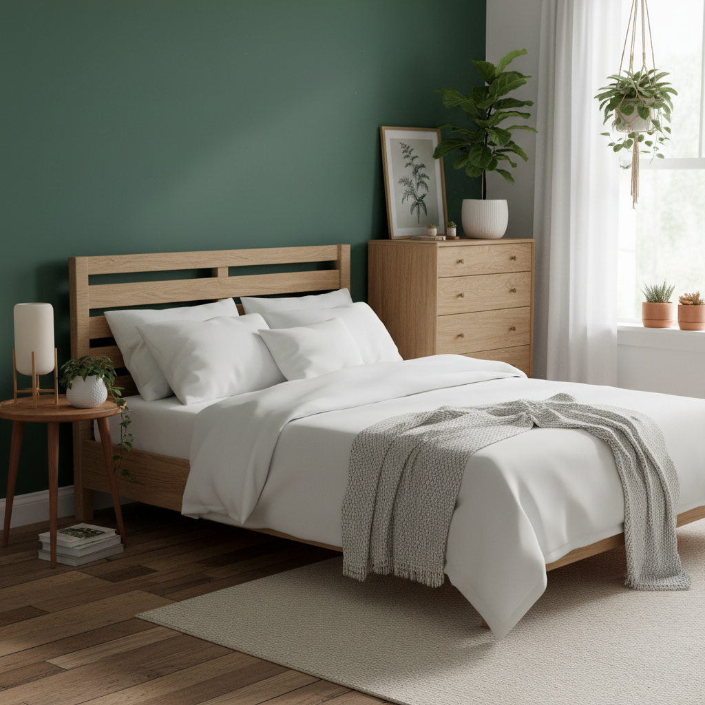
Forest greens and olive tones are the cornerstone of a natural fall palette, bringing the serenity and tranquility of the outdoors into your home. These shades evoke images of lush forests, mossy landscapes, and the enduring beauty of nature. Incorporating them into your décor creates a sense of calm and balance, transforming your living space into a peaceful retreat that reflects the essence of the season.
These verdant hues can be introduced in many creative ways. One of the easiest and most impactful methods is through the use of houseplants. Adding a variety of potted plants, such as ferns, succulents, or even small trees, can instantly breathe life and color into your space. Not only do they add visual appeal, but they also help to purify the air and create a more relaxing environment. Textiles are another fantastic way to incorporate forest greens and olive tones. Think of a velvet sofa in a deep forest green, or a set of linen curtains in a soft olive hue. These additions can add texture and depth to the room, creating a cozy and inviting atmosphere.
For a more subtle approach, consider using these colors as accents. Green cushions on a neutral sofa, olive-toned throws, or artwork featuring natural landscapes can all contribute to the overall sense of calm and tranquility. You could even incorporate these colors through smaller accessories, such as candles, vases, or decorative bowls.
The psychological effects of forest greens and olive tones are well-documented. Green is often associated with feelings of harmony, balance, and renewal. It is also known to reduce stress and promote relaxation. Olive tones, with their earthy undertones, add a sense of stability and grounding. According to a study by the University of British Columbia, spending time in nature can significantly reduce stress levels and improve overall well-being. Bringing these natural elements into your home through color and décor can have a similar effect, creating a more peaceful and restorative environment.
When pairing forest greens and olive tones with other colors, consider using warm neutrals like beige, cream, or light gray. These colors will create a soft and harmonious backdrop that allows the greens to stand out without being overwhelming. You can also incorporate natural materials like wood, stone, and linen to enhance the organic feel of the space.
How Do Jewel Tones like Mustard Yellow and Teal Add Elegance to Fall Decor?

Jewel tones, such as mustard yellow and teal, bring a touch of elegance and sophistication to fall décor, offering a vibrant and unexpected twist on traditional autumnal hues. These rich, saturated colors evoke images of precious gems and luxurious fabrics, adding a sense of opulence and refinement to any space. Incorporating them into your home creates a unique and stylish atmosphere that is both inviting and visually stunning.
Mustard yellow, with its warm and golden undertones, adds a touch of sunshine to the fall palette. It is a versatile color that can be used to create a variety of different looks, from bohemian chic to classic elegance. Teal, a captivating blend of blue and green, brings a sense of tranquility and sophistication to the mix. It is a color that is both calming and invigorating, making it perfect for creating a balanced and harmonious living space. We highlight using mustard yellow in our “Refreshing Kitchen Colors” guide.
One of the easiest ways to incorporate jewel tones into your fall décor is through textiles. Think of velvet throw pillows in mustard yellow and teal, or a luxurious wool blanket in a rich jewel-toned pattern. These additions can add texture and depth to the room, creating a cozy and inviting atmosphere. Consider painting an accent wall in teal or mustard yellow for a bolder statement. This can create a focal point in the room and add drama and character to the space.
Furniture is another excellent way to introduce these colors. A velvet armchair in mustard yellow can become a statement piece in your living room, while a set of teal-colored dining chairs can add a touch of sophistication to your dining area. When it comes to accessories, think of glass vases in jewel tones, gold-framed mirrors, and artwork featuring abstract patterns in these colors. These small touches can tie the entire room together and create a cohesive and stylish look.
According to color psychology, yellow is associated with feelings of happiness, optimism, and energy. Teal, on the other hand, is associated with feelings of calmness, serenity, and creativity. A study by the University of Maryland found that exposure to bright colors like yellow can boost mood and increase energy levels. Combining these colors in your décor can create a space that is both uplifting and relaxing.
To create a harmonious color scheme, pair jewel tones with neutral colors like gray, white, or black. These colors will provide a balanced backdrop that allows the jewel tones to shine. Metallic accents, such as gold, silver, or bronze, can also enhance the luxurious feel of these colors.
Frequently Asked Questions about Rich Seasonal Shades for Fall
What are some easy ways to incorporate rich seasonal shades into my fall decor without a major overhaul?
Start small and focus on accessories! Replace your existing throw pillows with velvet or knitted covers in deep reds, burnt oranges, or forest greens. Add a cozy throw blanket in a jewel tone like mustard yellow or teal. Swap out your summer-themed artwork for pieces with autumnal colors. Even small touches like seasonal candles or a decorative bowl filled with pinecones can make a big difference. The key is to layer in these rich shades gradually to create a warm and inviting atmosphere.
How do I choose a color palette that complements my existing furniture and decor?
Consider your existing color scheme and choose rich seasonal shades that complement it. If you have neutral furniture, you have more flexibility to experiment with bolder colors. If your furniture is already colorful, opt for shades that harmonize with it rather than clash. A good rule of thumb is to choose a dominant color, a secondary color, and an accent color. For example, you could use a deep red as the dominant color, burnt orange as the secondary color, and gold as the accent color.
Where can I find inspiration for decorating with rich seasonal shades?
Look to nature for inspiration! Observe the colors of the changing leaves, the pumpkins in the patch, and the sunsets in the sky. Magazines, home decor blogs, and social media platforms like Pinterest and Instagram are also great sources of inspiration. Search for terms like “fall decor,” “autumn color palettes,” or “cozy living room” to find images and ideas that resonate with you. Don’t be afraid to experiment and put your own personal spin on the trends!